
Body and Experience
- Natasha

- May 4, 2020
- 3 min read
Updated: May 13, 2020
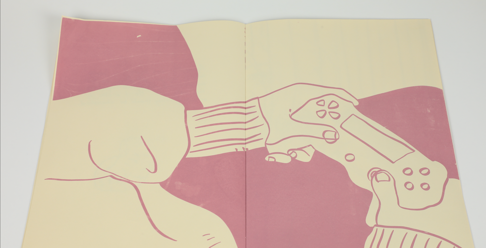
🎮🐶
This brief wanted us to explore ‘reportage’ drawing, a form of documentation. We were to look at the world around us and record what we see.
I was excited about this project as drawing from life is one of my strong suits and is something I really enjoy. However I was nervous about having to do it in public, but this is something I need to overcome.
Something else that worried me about this project was how broad it was, there are so many directions this could go so I decided to a focus point from the beginning to make sure I don’t become overwhelmed. I want to focus on people.
Artist Research : Feliks Topolski

I wanted to research other artists who have done reportage drawings to help me adjust my style to drawing very quickly. Feliks Topolski’s work is perfect for this. I love his fluid, expressive lines and how he is able to capture a character so simply. Something I am looking forward to about this project is the opportunity to draw many different kinds of faces and people. Sometimes when I am working from my imagination I can get affected by ‘same face syndrome’ where every person I draw looks the same – it is something I am working to overcome and hopefully this project will take me that step closer.
Artist Research: Lucinda Rogers

Even though I will almost certainly be looking at only people as my subjects for this project, I still wanted to look into the work of an artist who draws environments.
I love the way Lucinda Rogers is able to ‘organise’ her drawings with colour. I find when I am drawing background or drawing quickly my drawings tend to get messy and illegible. I think that even if I am to draw only people for this project, learning how to pick out certain parts of a drawing by adding texture or organising with colour will really help my work to remain understandable.
Development : Reportage Drawings


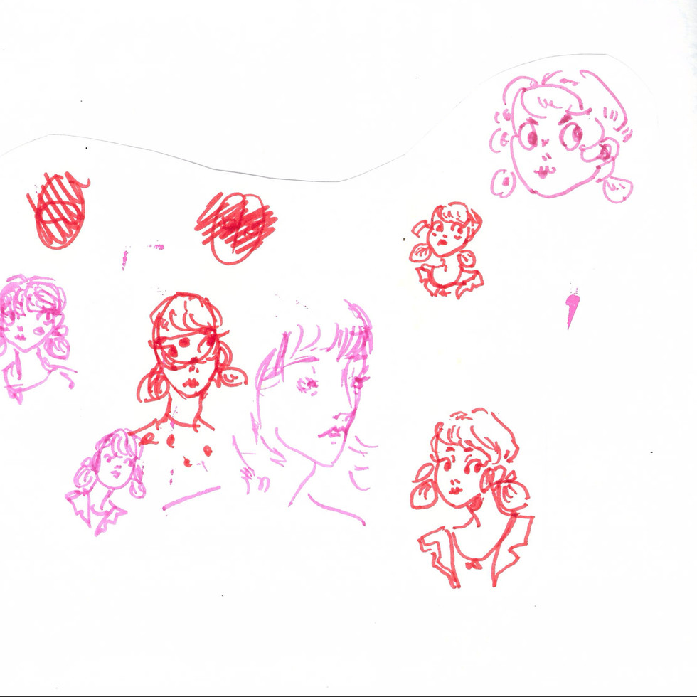


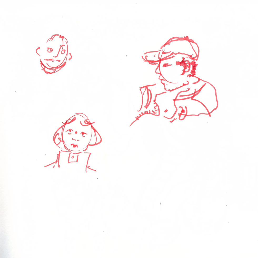


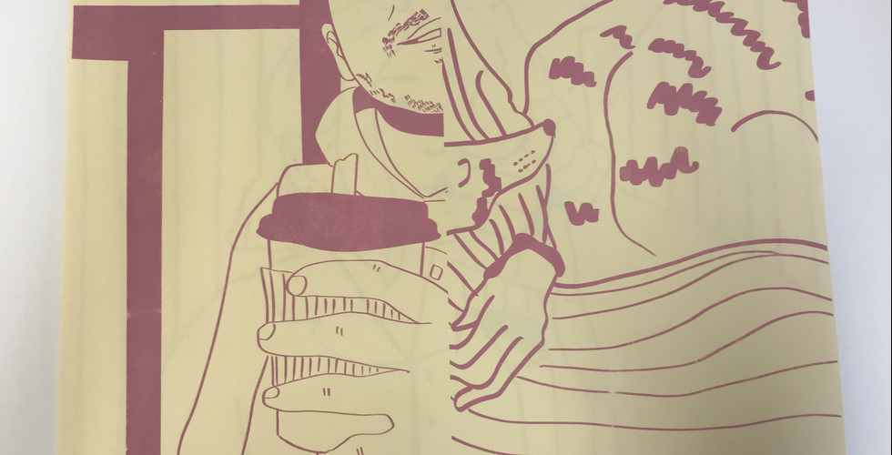
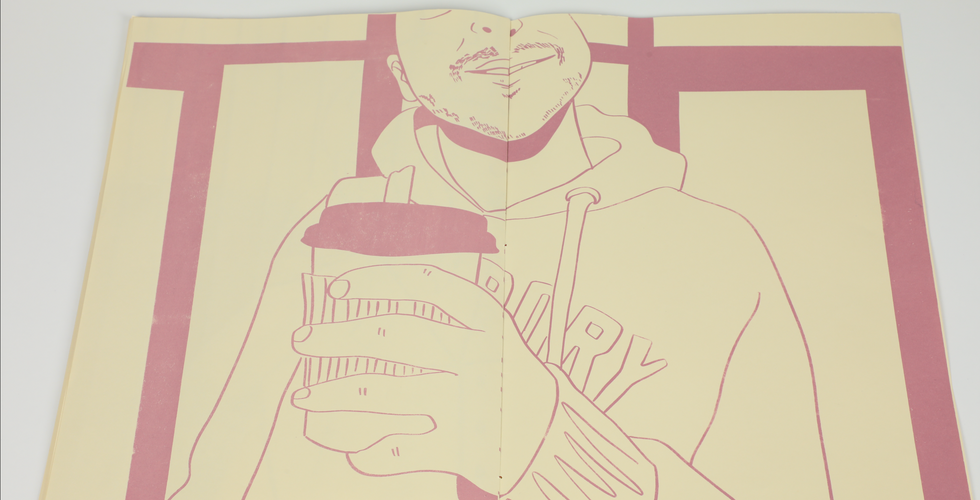
After looking back on my drawings I realised that I really enjoyed drawing people close to me like friends or family. I also noticed I liked drawing little moment. Personal moments, everyday moments that would be overlooked or forgotten. I want to focus on these moments and appreciate them with my work.
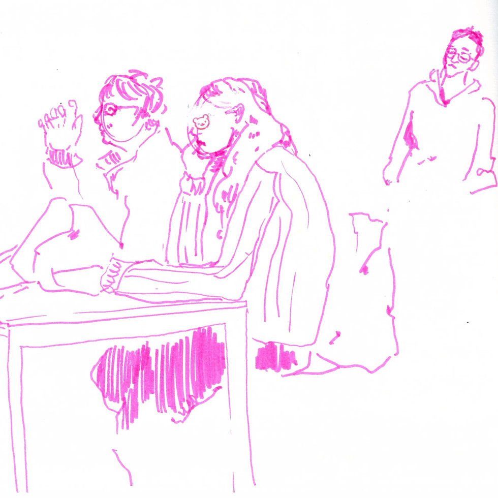
Development : Compositional Drawings


compositional drawings for my publication inspired by my Reportage drawings
Development : Imposing Plan

As I decided that for my publication I wanted to created an A3 screen printed bzine, when I was designing it I had to figure out how to impose the images by myself. This was the mapping I followed to make sure I didn’t make any mistakes while creating the pages.
I figured this out by first making an A5 mockup of the zine and numbering the pages. This was a really useful technique, and can save a lot of time when trying to impose a small booklet compared to setting up a file to software do it for you.
Development : Printing on Folex Laserfilm


After I imposed the images using procreate and photoshop, to insure I would get the highest quality possible I printed the positives on folex laser film
Development : Middle Page Composition


I wanted the middle pages and front cover to be slightly different the the rest of the content of the book so I decided it would be nice to print them with a design i hand drew on drafting paper – these are some of my initial designs. I think the oneI chose is so beautiful because no only does it help explain the concept behind my zine so nicely but it also embodies the concept of my zine with how it is designed
Development : Screenprinting


The prints before any folding or binding.
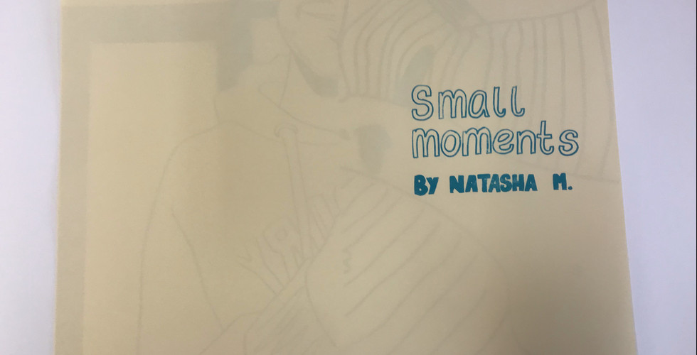
Outcome


Evaluation
My outcome for the ‘Body and Experience’ brief developed into a screen printed A3 zine that aimed to celebrate small moments. I am so proud of this outcome as I worked really hard on it. The print finish looks so beautiful and the scale and way the images are cropped helps to convey my message perfectly. I also really love the choice of colour I used for this piece, the purple with the cream colour of the paper is soft and nostalgic and compliments the blue I used for the text nicely.
The only thing I would do differently if I were to do this piece again would be to also try experimenting with colour, but i’m not sure if this could take away from the impact each illustration has, as I feel the simplicity of the prints have a special charm to them.


Comments