

SSP 2
- Natasha

- May 14, 2020
- 12 min read
Updated: May 5, 2021
👹🧙♀️
INDEPENDANT PROJECT
Workshop 01
The first workshop for this project required us to look into internships and companies we were interested in, in response to our SSP Inquiry form. The idea was to base our project on this research so we could use it to gain a leg up against competition for internships or as a pitch to a company we want to work with. While I was looking I didn’t really see any opportunities I was interested in, and I didn’t really want to use this project as a pitch to any company either. I am more interested in using it to develop myself and my personal portfolio. I want this to be almost a passion project that can be enjoyed by me and other people like me with similar interests and goals. I was also thinking that using this as a chance to develop work could be really useful for any opportunities that come up in the future that I really want to get involved in, rather than just picking one for the sake of it now. With this in mind, going forward I will be thinking about these two factors which I believe sum up the essence of the kind of work I am looking for: character design and narrative.
Workshop 02

Our second workshop ‘Interrogating Instincts’ was really interesting and an important factor in deciding what I wanted to do with my project. After collecting and collaging different pictures that I forgot I took from my phone camera roll, I was able to make different connections between them. From this I developed key words and picked out colours. This then developed into a spread displaying a character design I created based off of these words.
I really like how the final spread turned out. I am proud of what I could create in the allocated time as I think my sketches capture a lot of the girl’s character and they convey a lot of emotion and narrative already. I think this is a strong starting block for my project to develop from.

Workshop 03


Our third workshop called ‘outside in’ looked at lighting and negative space. I really enjoyed this workshop as since I got my ipad I have been doing almost nearly all my work digitally. I didn’t realise how much I missed used traditional media. The tasks we were set was to first, take a picture of yourself and set it to black and white, then using a black mark making tool draw an inverse version of it (dark areas light, light areas dark). After completing this first drawing we were to scan it and use digital software to invert the image and draw a final version based off the inverted drawing. I actually really like my outcomes which surprised me as I went into this workshop thinking I would not like what I would make at all. I love the last drawing the most, the simplicity and the style of it is so lovely and something I think I would not have been able to achieve if I did not do this workshop. It would be interesting to see if I could incorporate this new found style into my project somehow, it has too much character not to use!

Drawing Workshop

Our final workshop focused on finding a way to organise our ideas in a designed way. I found this workshop a little difficult at first as I was having trouble coming up with ideas… However, after I looked back and tried to visualise the aesthetic I wanted this project to have I thought of something I found pretty exciting and funny. I wanted to make something reminiscent of a witchy spell book. I did this through the use of gothic hand drawn typography combined with my own handwriting. I also looked at some medieval illustrations and created a little parody of one. I like how this turned out, even though it doesn’t look completely like a page out of a spell book I think I captured my way of thinking well in this drawing and it really helped me to organise my ideas and plan what I needed to do next.
Outcome Research : OFF

To further contextualise my idea I decided to look deeper into RPG horror games so I could more clearly visualise what my book would be working towards (in theory). This is a screenshot of one of my favourite RPG games of all time - OFF.
It is about a mysterious character known simply as “The Batter”, who is described as being on a "sacred mission" to "purify" the world of OFF. It is a surreal story that makes the player question their morals, their thoughts and their allegiances. In my opinion, it is genius.
The gameplay and fight scenes are very simple and use very uncomplicated movement animations. The characters are always presented from the same angles (front, back and side view when walking and one pose when fighting as can be seen here). I think as this is my first project of this kind I will work towards a similar style as this. I will also keep in mind how the game laid out and stylised. I think eventually producing some mock screenshots of my game would be a really interesting and valuable addition to my book.
Example Gameplay from OFF
Narrative Research : The Witch
Something that immediately came to mind when I was designing my character in workshop 01 was a movie I watched recently that left a massive impression on me called ‘The Witch’. This movie by director Robert Eggers is set in 17th century New England and centres around a banished puritan family who are haunted by sinister forces living in the woods near their farm.
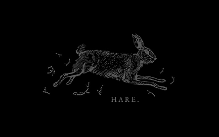
The cinematography is this film is phenomenal. The colour, the framing and sound all contribute to an extremely tense and scary atmosphere. It is extremely well researched. The use of symbols of the devil from traditional demonology such as the black hare and horned goat puts the viewer on edge and fills them with dread whenever they appear on screen.
I feel this movie is really relevant to my project as looking into it will help me think about how I should frame things and assist me in creating a frightening story.



Research Response : The Witch


In response to the movie ‘The Witch’ I decided to create a storyboard inspired by the screenshot of the hare. I want to develop my character’s story. I imagine her as a troubled young girl haunted by visions of death and destruction in her sleep. This encounter shows her first meeting with the entity causing them. Will she be drawn deeper into the darkness?
I did two versions of this short comic. The first is in full, vibrant colour which is something I am usually drawn to using in my work. With the second I looked again at ‘The Witch’ and its use of very muted colour and decided to create a grayscale version with just a hint of colour in the hare’s eyes. Personally I think this version is more impactful that the full colour version. It is more sinister and mysterious and more effectively communicates the dark nature I want this story to have. However, I think going forward instead of having most of the comic completely grayscale I will have very muted colours in select parts of each panel for example the skin or furniture. The only thing that will be have any vibrancy will be signs or sigils of the devil.
Research : Artist Books


I decided to look into other artist books for inspiration as to how I could approach mine. These two grabbed my attention straight away. On the right is a Lino cut piece by artist Kathy Fahey. I love this one in how it literally creates a world when it is opened. I think finding a way to create some kind of pop-up in my own book would be really impactful in showing the place it is set. I was also drawn to this one because of its use of relief printing. I have explored relief printing a few times during my time studying at LCC and it is something I really enjoy. Finding a way to incorporate it now would be amazing. The piece on the left is called 'Map ed Veveiis' by artist Genevieve Seille. I love this one because of how raw and ancient it looks, scratching into the surface of the book and using a rune like language creates a really magical effect. Maybe I should consider including illegible pages? Or pages with hidden messages? I love this idea of mystery and lost languages… or even the ramblings of someone driven to insanity, this is really add the essence of horror, uncertainty and intensity that I am aiming for.
Research : Concept Art Book







Watch a Flip through of the Book Here
Research Analysis : Concept Art Book vs. Artist Book
So I can better combine the two I have decided to look into both the typical Concept art book and a couple of artist books to decide what aspects I want to take from each. What I really love about the artist book by artist Kathy Fahey in particular is the fact it is lino cut and hand printed, this in itself gives it so much texture and life. I also love how the pop up aspect of it has the ability to transport the reader into the story… I can already imagine doing something like this with the town my story is set in, inspired by the Swiss city of Luzern. For the concept art book, what is really special and important about this is how clearly you can show very detailed illustration without any distraction. This will be very important for character and environment design spreads. A layout in this fashion also allows for image and research to be shown side by side without hindering the aesthetic qualities of the page. Personally I love being able to see the inspiration behind a work of art right next to it! So being able to do this in my own book is something that is quite important to me. I will need to take inspiration from both of these types of work if I want my outcome to be a success, it is detrimental.
Stylistic Research : Medieval Woodblock Prints


For some ideas about the kind of art style I wanted the game to have, I decided to look into the history of witches and some of their earliest representations. I really love these medieval wood block prints, there is something so charming about them... Maybe I can find a way to translate this in my own way thats more modern?
Artist Research : Aubrey Beardsley


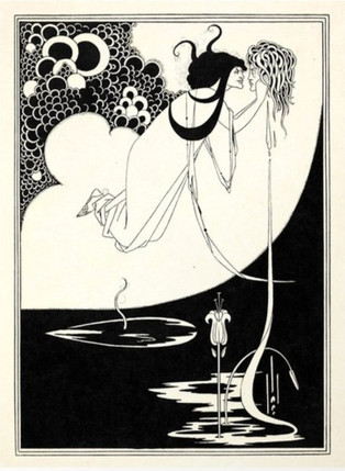
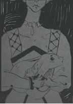
After looking at Medieval woodblock prints I decided to look to another illustrator for more stylistic inspiration. I love Aubrey Beardsley’s work because it is so simple but really intricate at the same time… it has a wonderful balance that is really pleasing to the eye. His work is relevant to my project because I want to create an almost gothic aesthetic in my outcome but still find a way to keep it suitable for the type of game I want to make as well as stylish. I feel Aubrey Beardsley encapsulates this wonderfully with his use of solid blacks and delicate lines… I think finding a way to combine his style with my own could be very interesting. These lino cut pieces (below) are from one of my earlier projects at LCC and I feel they are starting to capture the kind of aesthetic I am looking for.


Artist Response : Aubrey Beardsley

In response to Aubrey Beardsley I decided to redraw my initial sketches of the main character in my rendition of his style... I really like how these look - especially the solid blocks of black. It is really impactful and I think it could translate well to a game. It still needs some more development though... maybe some shading in grey? I will develop this further after the critique when I have feedback and am developing the character design further.
Stylistic Research : Yume Nikki Concept art


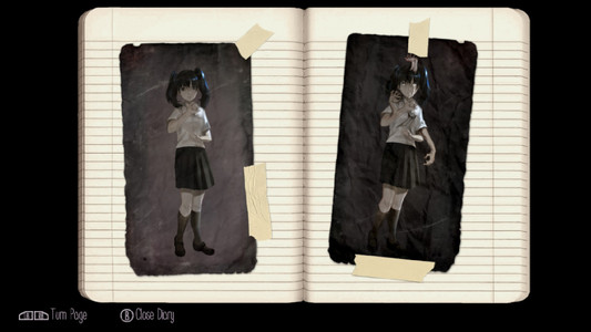
To continue my research into style I decided to look at the digital concept art book of the game Yume Nikki. The game focuses around a young girl named Madotsuki and the terrifying creatures she encounters in her dreams. Along with The Witch this was and inspiration for the narrative on my game. I find the Yume Nikki concept art book really interesting. It combines two very different styles as can be seen here. One is a scribbly, sketchy style and the other is a highly rendered, shaded and detailed style. Combining different styles is something I really want to do in my own concept art book and taking inspiration from this piece for that will help me a lot. I think the 'in-game' art style (one used for fake screenshots e.t.c) will be black and white and more sketchy, combining the style of OFF and I developed after looking at Aubrey Beardsley. Then, more detailed, coloured drawings on storyboards of the main characters can be included as stand alone pieces that would in theory only feature in the book.
Development : Critique





Ideas Development : Avatar : The Last Airbender concept art

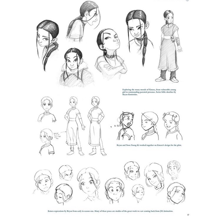

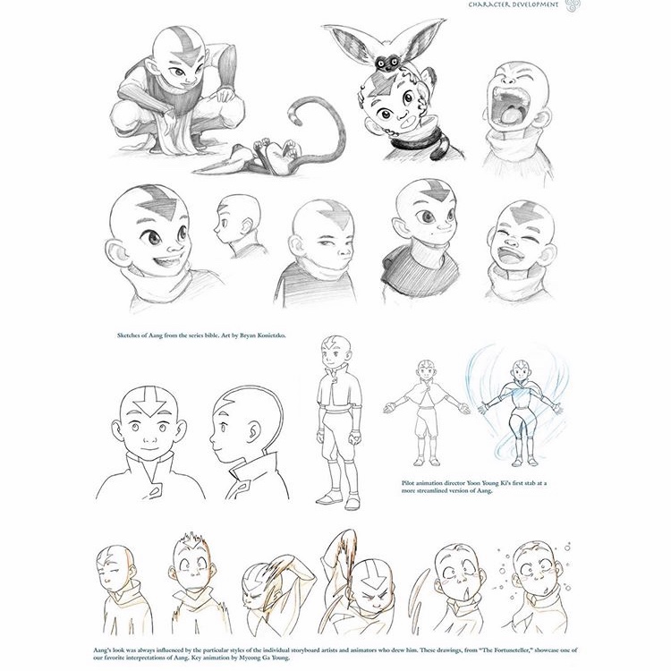

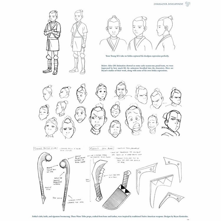

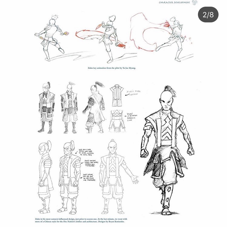
To continue my research and develop the work I produced in the workshops I decided to look into some professional concept art as inspiration as to how I can improve the presentation of my character and for ideas in how I could lay out pages in my book.
This is the concept art for the main characters of the series Avatar : The Last Airbender. No matter how much professional concept art I have looked at and studied I always find it really useful to try and find new ones in different styles, for different things and of different types of characters.
I chose to look at this work in particular as although the design development sheets are for a TV series, I think it will still be a really useful reference for the kind of outcome I want to produce. After looking at OFF I know that I will not be needing complex 3D character models for my speculative game and instead will just need the characters from different angles, in different positions and with different expressions similar to what is shown here.
Research Response/Character Development : The Last Airbender concept art


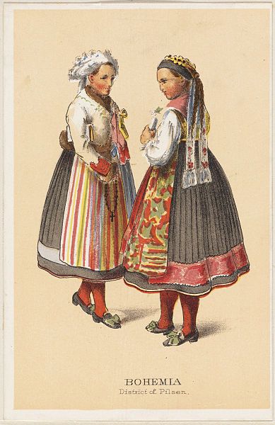




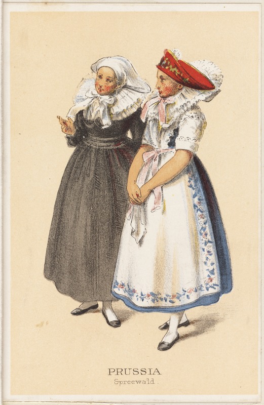
These designs were inspired by medieval Germanic peasant dresses.


I found it really difficult to decide which design I liked the best so I decided to create a poll on my instagram story and let my friends and peers decide. (could this count as market research?) . The design that won was number 3 followed by number 2.
I decided in response to this to use the design of number three but add small details from number 2 (such as the collar and waist bow) so there is a little compromise and I can use my favourite aspects of both of them in the final design.
Number 1 came in third pretty closely behind number 2 so I decided instead of wasting this design I would modify it t0 be her nightwear so she has two different outfits she can wear in game.


Primary Research Development : Luzern Architecture


Ideas Development : Family Bible

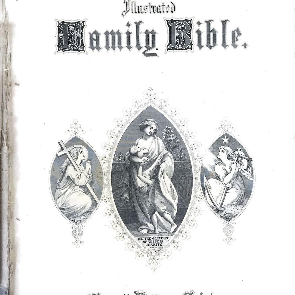


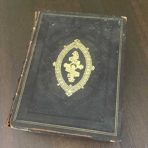
Researching further, I decided to look at a very old bible my family owns for inspiration. I think taking inspiration from a bible for my outcome will give me some interesting results. I want to be able to communicate the religious undertones of the story even through the way the pages are laid out. My book will be much less text heavy than these examples and will mostly consist of full page illustrations but I love how the images compliment the text on the pages and I will keep examples like this in mind when I do have to incorporate text. I became interested in looking into these techniques further after looking at this book : embossing, gold blocking, perfect binding and letterpress.



Method Research : Embossing


Embossing is the process of creating a raised image on paper or other materials.
'Embossing is done by pressing a sheet of paper (or other substrate) into a female die, that has a design engraved or etched into it. This is usually done with a male counterpart underneath the paper, so that the paper is sandwiched between the two and the design is transferred to the paper'.
It is a really great and simple way to add texture to a piece, taking into consideration the kind of outcome I want to produce I think this would be a really effective way to add interactivity to my book. More specifically I want to look more at the kind of embossing featured in the image to the right. As witchcraft and Paganism is really deeply rooted in nature I want to find a way to have these kind of natural textures on the pages. Presses of leaves, flowers , twigs, bark... I want to really experiment will this fully to see what kind of interesting effects I can create.
Method Research : Gold Blocking

'Gold Blocking is the process of personalising stationery, paper and leather goods with metallic foil, using a traditional hand operated press'
Taking inspiration from old illuminated scripts I want to experiment with the technique of gold blocking. I think incorporating thoughtfully placed areas of gold or gold illustrations will have a really strong effect and communicate the religious undertones the game will have really well. However, I am not sure if this technique is suitable for use on this paper or if it is just used for thicker, more durable objects like the book in the video below... I might have to experiment more with something like gold leaf as well.
Method Research : Perfect Binding

Although the binding method used in the bible I looked as was case binding, I will be looking at a similar method called perfect binding which is used for soft cover books instead as I believe it is more likely that I would use this method for my outcome. Perfect binding is a method of binding primarily used for paperback books. It refers to the process of binding a book primarily with glue. I want to use perfect binding in my book rather than something like Japanese style binding or saddle stitch as I believe the finished look will suit the aesthetic I am trying to achieve for my outcome. I think I want the exterior of the book to look more polished and clean like a concept art book rather than something more creative and wild like an Artist book could be.
Method Research : Letter Press
Above is a video from LCC about their letterpress workshop. I think including letterpress in my book will be a really impactful way for me to include clear, bespoke lettering when I don't want to hand write it. I think including letter press would add to the aesthetic I am trying to reach. If I choose the right fonts I think it could be really effective.


Comments