

Everything is New
- Natasha

- May 3, 2020
- 8 min read
Updated: May 5, 2021
👦🏻👩🏻
Brief Encounters
Our first task set to launch the beginning of our undergrad course was to produce four drawings of brief encounters of different kinds one being in person (near the elephant and castle campus) the others being online, in a book from the UAL Library and from a free newspaper or magazine.
I would define my usual illustration style as quite bold but also ornate and fluid… For this task I wanted to experiment with a technique I hadn’t used before and a material I wasn’t so familiar with, Gouache. I was inspired by another illustrator I follow on social media called Chelsea who goes by the name of @k_owa.

I was really inspired by her beautiful use of colours and the effective technique – I am usually quite the control freak when it comes to my work… I like everything to be planned out and perfect in pencil before I add anything like colour or pen. I decided to challenge myself and for these drawings go straight in with gouache – planning out the shapes with a larger brush and then adding detail on top using a smaller brush.
This was a little bit challenging as I don’t have many different sized brushes -mainly just large or medium so adding the tiny details or fine line that I wanted to were much more difficult than it should have been. Apart from this – I actually enjoyed producing illustrations in this way a lot more than I anticipated… It felt very liberating – not being able to fuss over every little thing made me work with mistakes and embrace them as part of each piece. I also found working in black shapes ‘upwards’ really fun.
The Pieces Produced:
In Person

For the piece about an encounter in person I was inspired by a small coffee shop I saw on the street – it was a tiny little booth with just on barista inside. The booth had loads of plants hanging from the ceiling and a small radio playing some song from the early 2000s. With this series of two illustrations I wanted to capture my intrigue and the small, rare moment of calm I was gifted in the bustling city of London by this encounter.
Online

The piece looking at an online encounter was inspired by the time one of my favourite illustrators and one of my biggest inspirations liked one of my posts on Instagram… It may sound silly but it was a really exciting and motivating thing to experience.
In a free Newspaper/Magazine

At first, I found it quite difficult to decide what I should do for the piece inspired by a free newspaper/magazine – I tried to find an article or image to inspire me but I wasn’t really interested in anything in the newspaper I had. That is when I decided to take inspiration from the encounter of actually getting the newspaper. I wanted to capture the briefness of the moment using ‘messy’ colour and expressive line work.
Task Two


Task Three




Francis Upritchard. ‘Wetwang Slack’. Barbican. 27/07/2018 – 6/01/2019
Wife in Straw Hat. 2017
Happy Sad. 2018
Hot Future. 2018
The Francis Upritchard Exhibition at the Barbican was extremely surreal and a little bit frightening. The reason I found it frightening was because of the way the artist’s beautiful sculptures were displayed – with no glass case surrounding them. This created the extremely strange sense of unease when taking pictures of the figures (I did take my own photos in the exhibition but I sadly los them after damaging my phone). This unease was caused by the feeling like the sculptures were about the reach out and grab me when I got too close… it was very unnerving at times. This really inspired me, however, I love creating sculptures and dolls of the human form – it is something I am extremely passionate about – and when I am creating I really like to try and evoke this same sense of un-nerve in the viewers of my pieces… I still need much more practise before I can achieve it so skilfully but having such a strong feeling from visiting this exhibition really excites me and motives me even more to achieve my goal.
Deconstruction Workshop

For the first part of the second workshop of the ‘everything is new’ project we used our images from the ‘brief encounters’ task as a starting point. We began with a one line drawing of one of the pieces we created then dissected the other works – their shapes, tone, pattern and colour… we extracted these and turned them into additional layers to the drawing. I really love how this turned out. I feel the contrast of black and red is really effective and the additional layers of shape and texture add loads of new meaning to the piece. I found this process quite exciting. Combing different concepts to create a whole new narrative is a really amazing process that I would love to explore again.

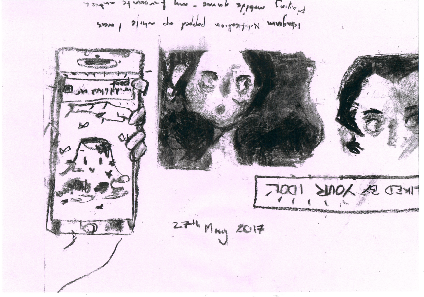
The second activity set in the ‘deconstruction’ workshop was focused on, firstly, light and shadow and secondly narrative. We used charcoal to map out the different tones present in a select part of one of our drawings. I found this really interesting as the expression present in the original drawing was still able to be conveyed even without line. I really love how the tonal illustration turned out… it is really different to my usual illustration style and out of context quite creepy… something that I originally wanted to convey with these two characters. Maybe next time I wish to translate this mood/atmosphere I will experiment with a similar technique.
We were then to add narrative to the piece by introducing additional imagery. I decided to show the story of the ‘encounter’ happened – I was playing a game and I got a notification about one of my favourite artists liking my posts! The twist to this task was, however, having to draw upside down… I could draw decently will some difficulty to a decent standard but the writing was too difficult to do – this is why most of the text is upside down. I think this effect is quite interesting though… It adds a strange effect to the piece that conveys the speed of the encounter, my disbelief and my excitement! I am hoping to experiment with comics sometime in the future so finding different ways for the reader to interact with the images through text could be really interesting and help me to translate the desired emotions more physically.
Reconstruction Workshop
The next workshop consisted of experimenting ways to reconstruct an image. We did this using the photocopier. Using different settings such as colour replacement, background colour as well as moving the image while it was scanning created effects I found most interesting.
Setting: Background colour → Magenta
I thought that the change of background from white to pink added a whole new layer of atmosphere to this image. It makes it look dreamy.
Setting: Background colour → Magenta → Moving the image whilst photocopying

To add to the dream-like effect created when changing the background colour to pink I decided to move the image whilst the copy was being made. I think this turned out so beautifully. When I look at this piece I really feel as if I have captured the hazy feeling of a memory well!
How to Critique

To begin our discussion on what is a critique and how we should critique we created a small brainstorm (above). This discussed ideas such as why critiquing is important, what critiquing is and what one should consider when giving a critique. The main points taken from this brainstorm was that it is extremely important to justify your opinions on a piece – making sure that your criticism is constructive and not based on a bias or personal taste. Secondly, we agreed that Critique is so important because of the plethora of different opinions on your work you can tap into: different cultures, socio-economic backgrounds and unbiased opinions… this is important because it makes sure that the work you are producing isn’t closed minded and that the message you are trying to convey with it can be understood from different view points… for example: it isn’t obscured by some cultural differences.
The second part of the discussion looked at voicing our opinions on the work of artists that we, as individuals, had picked out… but doing this only by only using one word. It was really interesting to see everyone’s different tastes all played out on a table – seeing the massive variety of themes, style and techniques in front of me was really exciting.
After writing down our opinions on different selected pieces we gathered again to discussed the different connotations words have – and how people might receive these words in feedback.

Above is a list of some of the words that were brought up to describe different pieces. The words in green symbolise a positive connotation, the words in red negative and the words in blue represent components in an image or neutral ideas. As can be seen most of the words brought up have both negative and positive connotations attached to them; this is because in most cases is really depends on the type and topic of the work being discussed… for instance: someone doing a piece that is meant to be raising awareness of the horrific trials refugees have gone through would most probably not want their work to be described as ‘cute’ or ‘humorous’ but someone who is doing a fun children’s book might love this feedback! Again, however, these are still generalisations so the message taken from this exercise is that when critiquing really consider your wording, how will the creator take this feedback? Is it helpful? This is so important in accurately conveying your opinions and making sure you are not saying something you don’t mean.

Finally, after taking into consideration all we discussed our original group from the mind map exercise was to create a poster that summed up what we think is important to think about when in a critique. We wanted to design something simple and that is an easy and simple reminder. This is when we came up with the phrase ‘”Because” is the Magic Word!’ This came from the idea that really justifying your opinions is one of, if not the most important thing to practise in a critique as an unexplained opinion/critique is really useless to the artist/creator.
Yayoi Kusama Critique

Yayoi Kusama. The Phallic Room. circa. 1960s
It was really interesting to critique this image of Yayoi Kusama in one of her first infinity rooms without any context. We didn’t recognise it as her until we were told as she looks so different – the lack of colour made it difficult to recognise this as Kusama’s work.
Without knowing who made this piece, how it was made, why is was made or how it was meant to be viewed the group I was working with had to make some guesses. At first we thought it was a photograph of some kind of strange fruit/vegetable market place but looking closer we can see how this is not the case – the forms engulf different objects and are defined constructed by hand. We then considered what the meaning of the objects – how they looked Phallic but they could also be representing danger like spikes… maybe even both?
We then considered how the piece was meant to be viewed… if this was the intended way (through photograph) or if you were meant to be immersed in the room and experience it as an installation. We thought about the components of the photograph and their significance toot’s impact – we focused on the figure. The expression of the figure is solemn, thoughtful, upset? We discussed how important this figure was in determining the mood of the piece. If she was happy and smiling we would intrepid the room, the piece and it’s meaning… so because of this we thought that seeing this artwork as a photograph was the artist’s intention.


Comments