
Hand and Eye
- Natasha

- May 4, 2020
- 6 min read
✋👁
Hand and Eye: Idea Generation
The ‘Hand and Eye’ project allowed us to explore character design and narrative through experimental methods. The starting point of the project was a drawing activity inspired by the movie Frankenstien, in which we created our own personal ‘monster’ by filling in an outline of ourselves with our fears and worries.

The monster I created – representing my fears
Honestly, I found this session very stressful as thinking about me fears and worries caused me to panic which in turn made me not be able to produce good enough work which then made me compare my subpar work to that of the people around me and feel even worse. I was also feeling very stressed about other things going on in my life, balancing my uni, work and personal life had been quite difficult. I’m not happy with how my monster turned out as I wish I could have been able to fill it more sufficiently. However I feel it has enough for me to work with as a starting point for future character development. As the imagery that is present is very personal to me and gives me something interesting to work from.
space
Hand and Eye: Idea Development and Character Creation
The second session of the ‘Hand and Eye’ project consisted of trying to pick one or more aspects from the monster we created to develop into a character for a storyboard. When trying to decide what aspect of this piece it was firstly quite difficult to chose just one of these things that are so personal to me. However, I eventually decided I should take inspiration from I decided to focus on the two ghostly figures. I firstly chose these as I knew I would need to be able to draw the character from many different angles and positions and if I decided to develop a more humanoid figure I would not be able to do this so well – the fluidity and abstract shape of the bodies allow for more freedom and expression. Because of the amount of stress the monster exercise caused, I wanted to create something good out of the fears before me. I decided to look into characters from my childhood that bring me joy and make me feel happy when I see them.
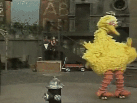
Big Bird on Roller-skates
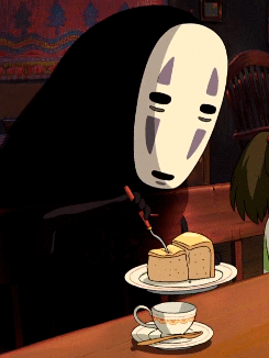
No face eating cake
After narrowing down from so many I decided to focus on the character ‘Big Bird’ from the TV show ‘Sesame Street’ and the character ‘No Face’ from the movie ‘Studio Ghibli’. Both these characters are very dear to my heart – ‘Big Bird’ because his design and mannerisms never fail to make me smile and he and his friends always taught me valuable lessons as a child. Secondly, ‘No Face’ as he is a character from the first Ghibli film I ever watched, Spirited Away. This movie had a massive impact on my life – and it one of the main reasons I became so invested in illustration, narrative and character design.
Dreamer by Supertramp
Something else we had to consider when designing the character and creating a narrative during this session was to take inspiration from a song from a playlist created by our tutors. After a while of listening to each one I decided on Dreamer by the band ‘Supertramp’ as the upbeat sound made me feel happy and the idea of creating something focusing around dreams sparked my imagination. Combining all the elements previously mentioned I created the character below as well as coming up with an initial plot idea.


Initial character design ideas
I really love my character design, she is really cute, really fun to draw and can be so expressive even with such minimal features. I really enjoyed this design task as not only is character design one of my absolute passions but it also allowed me to explore it in a way I don’t usually do. The characters I design are usually humanoid and quite detailed but this very unusually shaped, bird blob creature gave me a break from that pattern and gave me the chance to try something new which I have found to absolutely love doing. I am sure more abstract and strange character designs like this will be making appearances in the future – not only in my studio work but also in my personal work.

Initial narrative idea

Experimenting with different medias and combination of medias
The basis of my narrative is that my little character flies through the streets of cities and towns to find people who are having nightmares. She then eats the nightmares to turn them into good dreams.
space
Hand and Eye: Story Board development

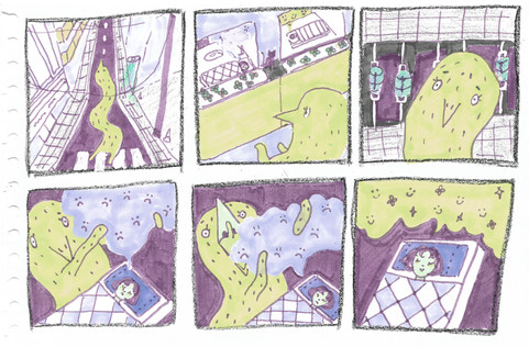
Development of initial story board of 6 panels
After experimenting with different materials at the end of the second session I decided to continue with the felt tip pen. Strangely, I loved the effect the low quality colouring pens created… this kind of streaky texture adds dimension and interest to the piece instead of it being too flat and perfect. I also liked how it is kind of reminiscent of how a child colours. I combined the medias of professional colouring pens (copics), crayola felt tip pens and a small amount of crayon to create the piece above.
When considering the colour scheme of the piece we had to take into consideration another limitation given to us but the tutors; that we where only allowed to use three colours (including different shades of those colours). To help capture a dreamlike effect I turned to one of my favourite illustrators for inspiration, Edmund Dulac. When working on this project I knew Dulac would be a valuable reference because of the amazing way he was able to capture the essence of magic and the essence of a dream in his paintings. He often illustrated for fairytales so this effect was a important factor of his work in order to create the right atmosphere for the story…


Dulac, E. (1908). an illustration forShakespeare’s comedy of The Tempest.
Dulac, E. (1909).Rubaiyat of Omar Khayyam.
Dulac, E. (1927) an illustration forThe Sleeping Beauty and other Fairy Tales.
However, even with how much I love the detail and amazing skill present in Dulac’s work I knew I wanted to create something with a more modern feel whilst still keeping that very dreamy atmosphere. For further inspiration I looked a more modern TV series – 'Bee and Puppycat'. 'Bee and Puppycat' is a series entered around a girl named Bee and her mysterious, pet cat-dog hybrid who fell from the sky. Puppycat helps Bee to get jobs by teleporting her to an alternate universe where a character called Tempbot sends her out on dangerous, paid adventures. The whole series has a very soft, dreamy feel to it but also manages to look modern. In my work I want to combine the nostalgic, traditional style of Dulac with the very soft but modern aesthetic of 'Bee and Puppycat'.

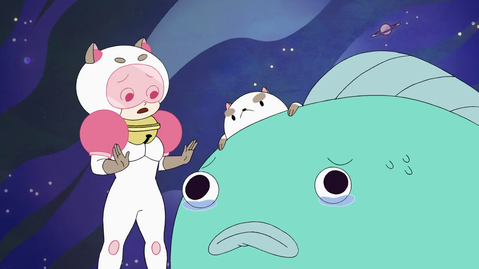


Screen shots from 'Bee and Puppycat'
So, even though I was hoppy with the colour scheme I came up with when first developing the narrative – as I feel it captures my idea well – I decided to experiment further in photoshop by creating different colour variations using the hue and saturation tool. Below are my favourites from the experiments.


(1-6 left to right)
In the end I decided to keep to my original colour scheme as although these are very interesting I think the atmosphere created in the first is closest to what I am envisioning. However it was a very close call between the original and 6. 6 has a very usual feeling to it – it is very dreamlike an creates the feeling of it being nighttime well but I am not sure if the intensity of the pink could make the story seem more menacing and scary rather than a happy story.
Hand and Eye Final Outcome

Overall, I am happy with how my storyboard turned out. The colours create the atmosphere I was envisioning very well and add life to my character. The media chosen work together to create depth and a feeling of nostalgia whilst still keeping my piece looking professional.
However, there are some things I would like to improve if I were to develop this piece further. Firstly, I feel that the third story board I created when developing this project is much more dynamic. I think I enjoy working in squares more and find them easier compose within. With the developmental storyboard I was also much more free with the way I drew - I did not draw with pencil first but started straight away with pen. I think this actually gave the piece more movement and made it more interesting. As the little imperfections and irregular forms adds character to the piece.
To conclude, although I am happy with how my piece looks in terms of the atmosphere it has and the feelings it invokes. I feel there are still some things that could be improved. Looking back, when I was working with squares rather than rectangles to create my storyboard I discovered that my work was much more dynamic and framed better. I have also discovered that my work tends to become more frigid and loses some of the energy it has when I plan the composition using pencil first.
With these factors in mind I can use them as a way to improve my work in the future. I should consider either working using squares when framing something or practise using rectangles to frame my work. Also (when appropriate), I should practise using pen straight away when creating a drawing instead of planning out with pencil .


Comments