
Identities and Place
- Natasha

- May 4, 2020
- 7 min read
Updated: May 13, 2020
🛳✈️
MIGRATION AND GRAPHIC STORY TELLING
The aims for the ‘Identities and Place’ project were to look into themes of migration to promote social engagement; To be able to understand how our practise shows our place in human culture and how it is able to not only leave an impact on society but also ourselves.
I was nervous at the briefing of this project, I find politically-based projects really hard, especially when I have to explore them not by choice. Something else that initially worried me was that we had to explore a ‘personal experience’ of migration, as someone who was born and raised in the UK and never lived or studied abroad I was struggling to think of a starting point.
Research : Choosing an Era
As a starting point for our Graphic narrative we were asked to choose one of these three eras to base our research: the 19th century, 20th century or 21st century. I decided to look into the late 20th century, as this is when my mum immegrated to England to marry my dad. I want to look into their story as it is something that is more personal to me. This way I am also able to talk to the people I am writing about in person which means I can avoid generalisation or misrepresentation in my work. Which is something that could be really easy to do in this project if it is not researched thoroughly enough.
Research : Defining Key Words
Secondly, as preparation for our first workshop session. We were asked to write down what the following words indicate to us.
Asylum Seeker: Someone who has to flee their home country for the right to international protection. British: Someone or something from Great Britain or the UK. Caucasian: someone with (predominantly) European Heritage. Émigré: someone who has emigrated as a form of social or political exile. English: someone who is native to England or referring to the language. Ex Pat: someone who permanently lives in a country where there were not originally raised. Foreigner:someone who is not a national of the country you are in. Illegal Alien: a term for a foreign national in a country they have no legal right to be in (I think this term is dehumanising and awful). Immigrant: someone permanently living in a foreign county. Migrant: someone who moves to another country for a better quality of life. Person of Colour: someone who is not ‘white’. Refugee: someone who has had to escape their country to avoid things such as war, persecution or natural disaster.
Artist Research : Simone Lia


As I have not had much experience making comics I decided to look into some comic artists for inspiration in composition, framing and colour scheme. I really love the linear, blocky style of Simone Lia. The simplicity of each frame makes it so that the image isn’t overwhelming.
I also love her inviting colour palettes, even with her use of cool blues the images stay warm and inviting.
These are things I need to consider when creating my own comic. I need to make sure my compositions aren’t too crowded and that I consider my use of colour to make sure that it doesn’t conflict with the mood I’m trying to set and the emotions I’m trying to convey.
Artist Research : Keiji Nakazawa


Keiji Nakazawa was the second artist I decided to look into. I love his use of perspective and how he can spread a moment across panels.
I also find his use of linework and texture inspiring. It adds dimension to the imagery. Something I often find with my work is that it ends up looking really flat and uninteresting, taking inspiration for Nakazawa work could help me overcome this problem.
Research : Immigration folder


In order to marry my dad and live in the UK my mum had to prove that she was just doing it to get a marriage visa. To do this she had to put together a file of letters, bank statements, flight records and pictures proving that she had known my dad for a long time and that she had been living with him, working and paying taxes.
This invasion of her privacy and the cold judgement of her happy memories made me feel really angry, how because she wasn’t born in this country it was made so difficult for her to get married. She couldn’t even choose where she could get married – it had to be in a registry office.
Even though I was upset thinking how difficult it is for not only my mum, but others who have to go through this process to get married I still really enjoyed looking through these old pictures of my parents having fun together. The story of how they met is so sweet and I love them so much. I want to illustrate their story through my outcome and use the pictures provided as a starting point.


Studies from some of the images in the folder
Development : Comic

Responding to Critique
This is the outcome I created for the initial critique of this project. I really like this comic, although it is simple I feel I was able to capture a moment well.
The critique gave me really useful feedback to help me develop it further. Firstly, the class agreed that the strengths of this outcome was the illustrative style featured, how I layered photography behind the illustrations. They also thought my personal link with the piece was strong, this meant a lot to me as finding that link was something I was worried about at the beginning of the project.
As for developmental advice, I was suggested to experiment with photograms (because I mentioned wanted to try and capture the physicality of a film photograph) as well as print techniques such as lino or screen. This was interesting as I actually didn’t consider moving the project in this way. However, when I looked back on the artists I researched and thought about the interesting ways I could display my comic through print, this suggestion really excited me.

Development : Photogram


testing exposure times to see what gives the best result
test of 20 seconds and 15 secondstest of 5 seconds and 25 seconds
splashing. the paper with developer (15 secs)
20 secs
These are two of the photograms I created when experimenting in the darkroom the one above was created by splashing the developer onto the exposed paper with a paintbrush and the one on the right is a simple, clean print.
I like how these turned out. I love their physical qualities, the textures and the glossy finish. However, I feel that when the comic is in black and white it loses something… it feels colder and sadder.

Development : Paper Testing

After experimenting with the photograms I decided I wanted to develop further in print. I first decided to look into different papers so I could get a good idea of what would be nice to print on beforehand. After looking at 5 different types I decided that for my first prints I wanted to use the ‘Mango’ coloured card (290 gsm) as well as another card in the same weight but in the colour ‘Bougainvillaea’ (not pictured) – a shade of bright pink.
Development : Cutting the Lino


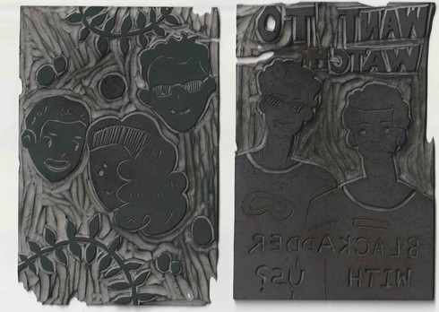
Development : Test Prints


These are the results of my Linocut test prints. What I wanted to focus on with these prints was experimenting with colour. I really like the colouring of the yellow one. I initially used different colours for each frame to test how each colour looked against the yellow. Surprisingly I actually really like how this looks and want to take it further. It helps to separate each frame and creates overall a more unique look.
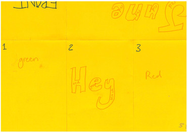
Things to keep in mind moving forward:
using thinner card nest time (‘Mango’ paper 135 gsm), this one looks messy and cracks when folded like this.
using a variety of colours looks nice
mark out sections before printing


Development : Ghost Prints


I really love how these ghost prints turned out. They are slightly more faded but still clear (I guess this is because I put too much ink on the initial prints). Maybe considering a finish like this for the final piece could be interesting?
Development: Compositions for the Remaining Frames of the Comic


Compositional drawings for the fourth and back pages as well as the front cover of the concertina.


planning the colours for each from and doing a layout plan so I don’t mess up
Development : Front Cover

Scans of the polaroids I took of my parents for the front cover. I took multiple to make sure I could get a picture I was really happy with. The top right is my favourite.
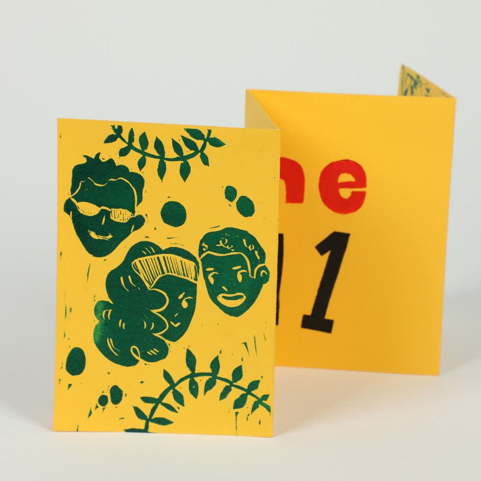
Outcome


Evaluation
My outcome for the ‘Identities and Place’ is a small folded lino printed comic showing how my parents met. I am really proud of how this outcome turned out, even though it is small I feel it is a great accumulation of what I wanted to achieve in my outcome. Firstly, the aesthetic of the original comic I created carries across very well and the use of colour conveys the inspiration I took from the film photographs I was originally inspired by. I also love the colours because of how warm the piece feels. It almost places you in the scene, like you can feel the hot australian sun. Also, I love the style I was able to develop for this project. It informed by artists that inspire but also has a lot of my own personality in it. I struggle sometimes after using other artist’s work to evolve my own. I find that I either produce something that completely disregards the artist(s) I have been researching or accidentally copies them too much. I think with this project I have managed to find a great balance.
What I think I could have improved on is how I carried out the actual printing process. I realised I used too much ink which meant some of the images lost line clarity. Even though the effect it had on the final outcome isn’t too detrimental, it is something I should keep in mind when I next use this technique. I also realised quite late into the process how useful creating masking tape ‘handles’ on the back of my linocut stamps are, I messed up a few prints by not being able to place the stamps neatly, if I had realised earlier how much easier these handles made the printing process I would have had to do less prints before getting a final I was happy with.


Comments