
FMP
- Natasha

- Apr 4, 2021
- 42 min read
Updated: May 25, 2021
🍄🧚♀️
Inquiry : Initial Brief Ideas
Above is the first brief I wrote for the Final Major Project, it doesn't have much detailed information as while writing it I was also working on the Penguin and D&AD projects simultaneously so couldn't too much time thinking in detail about what I was going to do yet.
However, starting to write the brief for this project earlier helped me to begin considering what I want to work towards and create with it. I already knew that I wanted to do concept art, as this is what I want to do in the future, but deciding what for was the next step. Thinking back on what I have do so far (for my minor and integrated projects) I realised both of these developed designs for animated movies. Although working for a movie would be something I would like to do, my real dream is to be in the video game industry. From this I decided that this project would best be used to develop art for a conceptual game.
I also considered weather I wanted to create something completely original (e.g. based on a narrative and characters i would write myself) or something already pre-exisiting. After sharing my ideas with my tutor she advised me to pursue a narrative that has already been written in order to save time. This makes sense as although this is a major project we only have a couple months to work on it which is very short in comparison to our previous two this year... The challenge now is to decide on which story to base my work.
Inquiry : Looking Back at Past work 1
To begin brainstorming ideas for my project, I decided to look at previous projects of which I looked at novels/stories that inspired me.

During my first year I worked on a re0imagining of the The Picture of Dorian Gray I picked this story as I had just finished reading it at the time. The project was a concept for a potential comic in which all the characters are represented by anthropomorphised British wildlife to add a quirky, modern twist to the classic tale. This is when I worked in exclusively traditional media so it would be interesting to revisit this project now I have access to digital tools.
Inquiry : Looking Back at Past Work 2


Thinking more about past projects I remembered another I revisited briefly during my Integrated project, one I created during my final year of A-levels.
This project was based on the book The Hunchback of Notre Dame I became very interested in this story after reading it the summer before. It was not a direct re-imagining but more loosely based around the narrative and characters. The outcome for this project was actually two sculptures however I produced some initial character designs in preparation for these, so I could develop from this... It is really motivating to see how much I have improved over the past 3 years and would be fun to revisit a project I was so proud of at the time I made it.
Inquiry : A Midsummer Night's Dream
I have been discussing ideas for my FMP with my family a lot as I have been feeling quite uninspired and have had trouble thinking of what story I want to explore. I went on a long 5mile walk with them and tried to use this time and change of scenery to think about what I really wanted to do and how I could relate this project to my current interests through the story I pick.


Midway through the walk we were discussing The Hobbit as it was the first proper book my dad had ever read through before. I then started thinking about what the first book I ever read through was and I remembered reading through Shakespeare's A Midsummer Night's Dream during break times in primary school and being completely absorbed in the world and the characters, I remember loving the faerie Queen Titania. Looking back on it I think this is where my interest in fantasy and the fey really began to blossom and develop into something that is a major influence on me and my work now. Basing this project on the story of A Midsummer Night's Dream would not only allow me to explore some of my personal interests and passions (fantasy and faeries) but will also be a really rich and interesting starting point for me as there have been so many unique interpretations of this play.
While on the walk I took lots of pictures of my surrounding environment and little details that interested me, considering this story is set in a magical woodland in Athens these pictures should come of use to me as reference later in the project.
Inquiry : Mindmapping

While waiting for my copy of A Midsummer Night's Dream to arrive I decided to start mind mapping some ideas. I wanted to think about, firstly, how I could translate this play into a game context as I think this will be the biggest challenge of the project. Then secondly, how I could have my own original take on such a classic story.
From this mind-map I think I will be focusing on one of two characters from the story - Titania or Bottom, they both have quite minor roles in the play but where the ones I was most drawn to when I first read it as a child. Bottom as he was the funny comedy relief and Titania as she was the beautiful faerie queen. I also love the visuals of this ethereal being falling madly in love with a person that has a donkey head, I find it so amusing and wonderful.
Focusing on these two more minor characters rather than the main four (who are in a complicated love triangle style situation) will help me to create something unique and interesting. However, as we only have about a month to work on this brief I think focusing on just one character is the best idea. This is so I am able to go really in depth with the research and development of their design and create the best outcome possible in the time given. Considering she was the first that came to mind during this brainstorming process and the character I have always been more drawn to - I have decided to focus on Titania.
----------------------------------------------------------------------------------
Inquiry : Research Question and Brief
I haven't decided what the research question for this project will be yet... I think it will make itself apparent as my ideas grow and develop.
Area of research:
Narrative, Storytelling, Fantasy, Character Design
Project title:
Titania
How the project relates to and builds on my areas of interest and strengths:
The fantasy genre is one of my longest running interests, ever since I was young I have been fascinated with things such as faeries, dragons and unicorns... this love only grew over time as I was able to explore more and more of what the genre had to offer. Choosing to look at Titania from A Midsummer Night's Dream will allow me to combine one of my biggest passions into my Final Major Project, which I am sure will be an important aspect of how successful my outcome and developmental work will be.
From my Integrated and Minor Projects, in which I explored character design, I know that I am able to produce strong work towards such an outcome. Also, since it is what I want to go into in the future choosing this as the basis for a brief aimed at developing my professional portfolio is only common sense.
BRIEF
Create character concept art of the character Titania for a video game inspired by the play A Midsummer Night's Dream .
----------------------------------------------------------------------------------
Research : 1937 Stage Production of A Midsummer Night's Dream


As a starting point in my research while I wait for my book to arrive I decided to look at past stage productions of A Midsummer Night's Dream. I have had the middle image of Vivien Leigh as Titania saved to my inspirations folder for ages now as I love the costume design, so I thought it would be a good idea to look for more images from this specific show.
I love the whimsical and dramatic costumery of theatre, I think it is so wonderful and looking at these images has made me start to consider how I could incorporate this exaggeration into my character designs and if it would work in a game setting. Stage makeup and costumery is done like this so the features and expressions of the actors are able to be made out by audience members that are even as far away as the very back of the room... I think using this as inspiration could be very interesting and help me create strong designs. I also love the idea of relating the designs featured in my game to the story's original roots.
Research : Stage Makeup - The Phantom of The Opera


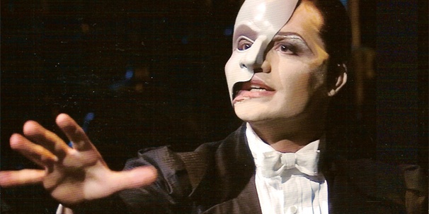


One of my favourite stage productions is The Phantom of The Opera, the story is so tragic and creepy at the same time, not to mention the musical score is fantastic.
One of my favourite things about this play is the costume design and makeup. The makeup most focused on is usually the covered side of the Phantom's face, but what interests me most is the makeup used to exaggerate the features on the side that can be seen. I love the it, the silver eye shadow, reddened lips and elongated eyebrows make him look like a beautiful other-worldly creature. This adds to the seductive and mysterious aura he is supposed to have when performing. I think taking inspiration from this type of design for a fey creature would be effective, as in my mind they have a similar effect on people as the phantom does.
Artist Research : Maria Bjornson for The Phantom of The Opera

Inspired by my research into theatre costume design so far and while waiting for galleries and museums to open I looked into the V&A's online Theatre and Performance archives. While looking through their collection I found this costume design for The Phantom of The Opera stage performance (above) at Her Majesty's Theatre by artist Maria Bjornson. I loved this design for Christine's dancer outfit so I decided to look more into other designs for TPoTO she has done.


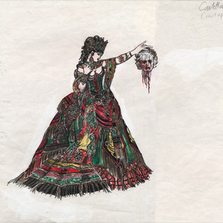


Through further research I found these three designs that I really loved, the colours and patterns are so special and make them unique from other designs created for the stage production. Maria Bjornson's work has had a massive impact on the visual language of the Phantom of the Opera as many of the designs she created are now the ones that are most iconic, going as far as influencing the costume design in the 2009 movie production. I especially love the Chinese inspired design for the phantom (left), it helps with this aspect of visual story telling all good costume design should have. Having him wear this outfit whilst everyone else wears very traditional European fashion distances him from the rest of the cast, creating the sense of solitude and misunderstanding that should surround the character of Erik/The Phantom.

Research : A Midsummer Night's Dream (1999)


I really want to see A Midsummer Night's Dream in theatres as it should be, but because of COVID I won't be able to for a while, so I decided to watch the 1999 movie starring Michelle Pfeiffer as Titania.
I really enjoyed this film, it was so aesthetically pleasing... there is something about the filter on 90/early 2000s films that give them such a charm. I also loved the costume designs for Titania and Oberon specifically. For Titania, the flowers in her hair and the glittering sheen of the clothing are so magical and for Oberon I loved how he had an ancient roman aesthetic to his costume design. Considering this play is set in an enchanted woodland near the city of Athens, this is a wonderful reference to its' lore. The costume design set a mood and helped the audience feel like they have not only travelled to a different time but also to a different, enchanted world.
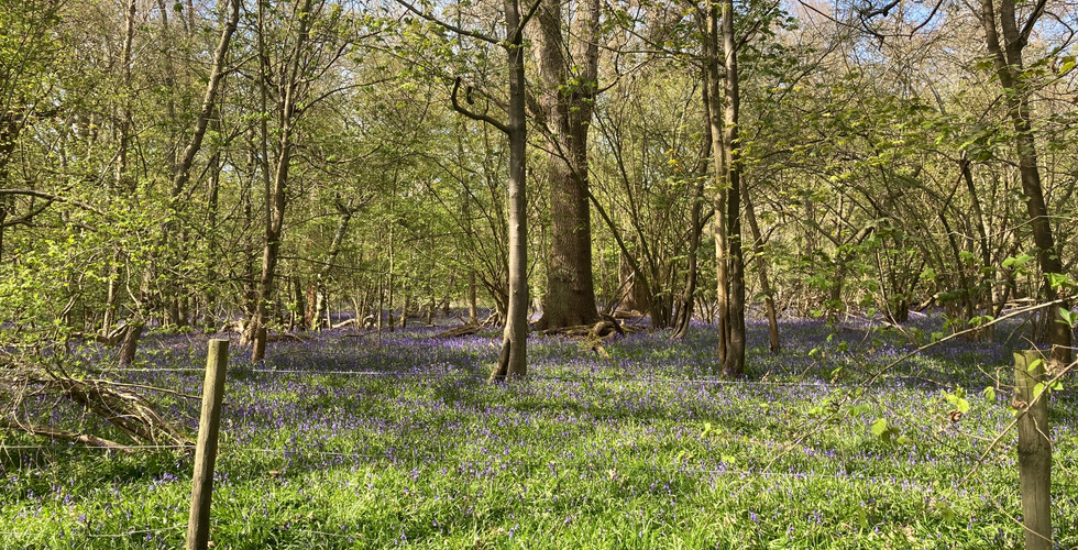
Primary Research : Woodlands
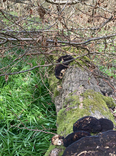


Since the sun was shining and I was home in the countryside for the easter holidays I decided to visit a local woodland that I have walked in since I was really little. I decided to visit this one in particular as when I use to go there, my parents would always tell me about how there were faeries living in the trees. Specifically, in the stumps of ones that had been felled or in holes between their roots. So, as I was walking I decided to take pictures of the places I remember looking when I was younger. I loved the textures and shapes that I saw while exploring. My favourite is the middle picture in the bottom row, the baubles on the tree are so interesting and made of moss ! I think thats so cool, I want to experiment with using textures from nature in the designs I create for this project. I also managed to find some large black fungi that remained from autumn, I want to study some more mushrooms though the duration of this project too as they have always been something that have interested/inspired my creatively.


As well as focusing on the perviously mentioned stumps and holes I also took landscape pictures of areas in the woodlands that I thought would come in handy as references for me as this project develops. I love how the sun looks as it reflects off the lush green undergrowth. I hope to come back in a couple weeks time when all these shrubs have bloomed into bluebells and the woodland floor is carpeted with a beautiful purple hue. It is one of my favourite sights to see and will be great images to look back on as it looks like something straight out of a fairytale.
Primary Research : Reading A Midsummer Night's Dream


To have a better understanding of the play and the material I am working with I decided to re-read A Midsummer Night's Dream. As it is a play there isn't any character description to work with so I have been highlighting lines from the play that could inspire the design or a scene that I place my character design in. It was really fun to read through it all again, it felt really nostalgic for me and made me feel even more excited to work on this project.
Artist Research : William Heath Robinson


My copy of A Midsummer Night's Dream is one that is illustrated by the artist William Heath Robinson. It was wonderful to see his visuals along side the writing, they capture the magic of the play so beautifully and it helped me to enjoy this re-read of the play even more. Above are a few scans of his illustrations, I love the simplicity of them and how detail is added through the use of intricate pattern and block colour, it's so special.

While looking for other versions of his illustrations for A Midsummer Night's Dream I saw this cover for a 1914 hard cover publication fo the book. I love the use of pale colour in this it helps to create a dreamy atmosphere, as if you are looking at the world through a mist or magical haze. Looking at this I started to think about game formats... something I have been considering recently is the concept of creating an 8-bit game. Usually these use bright colours or more traditionally in black and white (think some of the first games for the Nintendo Gameboy such as Pokemon red or Tetris). Maybe something interesting I could look at is instead of having an 8-bit game in these formats I can try experimenting with something more soft and muted like the illustration above.
Research : OFF

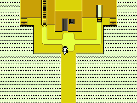


One of the games I thought of when considering this concept was OFF. Although it does use darker colour palettes later on in the game, the first level or 'Zone 0' uses a yellow colour scheme. I think if I were to do something like this I would probably not use such dark black line, either a lighter grey, darker yellow or not line at all.
OFF is one of my favourite games of its' genre, the story is so interesting and unique and takes a dark turn near the end. I also think it's simple combat style is very effective, however, I am wondering how I could develop the story of A Midsummer Night Dream into this kind of game type... And if the game I'm conceptualising will have any combat at all, I might have to brainstorm this further or consider another direction. I think that I would like to pursue an 8-bit game though, finding a way to combine this with more detailed portrait art for dialogue.
Research : Yume Nikki


Yume Nikki is a game created by Japanese developer Kikiyama, made with the same software are OFF (rpg maker, 2003) but lacks most elements commonly associated with role-playing games, such as battle, levelling up, and quests. The game's primary objective is to collect items known as "effects" that grant the main character (Madotsuki) new abilities and allow players to progress to new areas, the game ends after 24 of them have been collected.
Not only do I think this play style would fit the narrative of A Midsummer Night's Dream better than that of OFF but I also think that it's creepy, surreal aesthetic and visuals would fit very well too. I want to take inspiration from the scenes and areas of Yume Nikki but change it in a way that makes it lighter and more misty rather than so dark.
Although I won't actually be developing the game throughout the duration of this project, knowing the gameplay style is still very important to consider when producing concept art. It will allow me to consider what kind of movements my designs must be able to have and help me to ensure they fit well into the setting.
the end song of the game's OST, it is a beautiful composition and I feel it fits the mood very well.
Primary Research : Tickets for A Midsummer Night's Dream

Since I am living in London while studying I decided to check if there were any performances of A Midsummer Night's Dream on in Shakespeare's Globe, just incase. Even though I could always see a recording, watching the play live is a completely different experience and would be very important to me while working on this project.
Luckily enough there was a live performance planned! It will take place on the 19th of May - since I have an EC this will be before my submission deadline... even though I will be done with most of the work for my project by then watching it live is too good of an opportunity to pass up, even if it will only really make an impact near the end.
Artist Research : Brett Manning


Brett Manning is an Indiana based artist who is inspired by witchcraft and faerie beings. I love her interpretation of the fey and how she incorporates nature into their designs... she makes them look beautiful and enchanting yet also mysterious and dangerous. I want to take inspiration from this when designing the characters of A Midsummer Night's Dream so that I am able to create something visually striking. With all the magical mischief the faeries cause in the play it would only make sense for them to look so otherworldly, it will also give me the opportunity to experiment with many different fantasy features and textures - something I haven't been able to do in my two most recent projects as the main characters were all human par one.
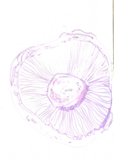
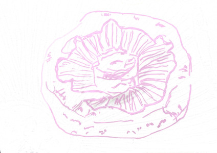
Research : My Favourite Mushrooms
Something that I have always loved and have been a source of inspiration and intrigue for me are mushrooms and fungi. Their textures and colours never fail to inspire or bring joy, I just think they're so cool !! Below are some of my favourite species.


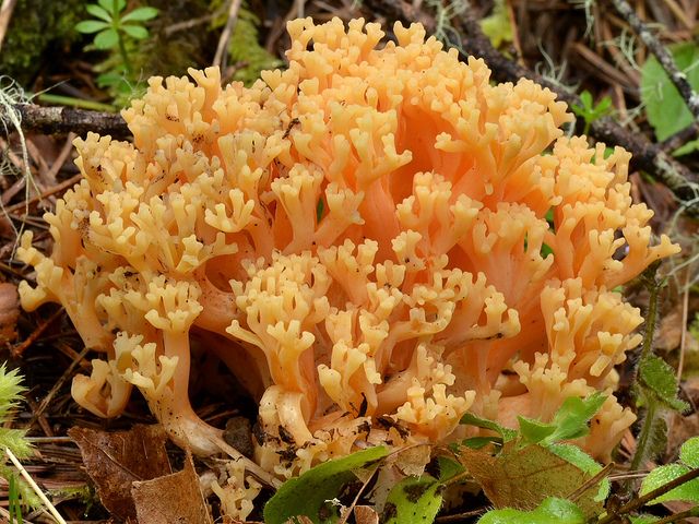


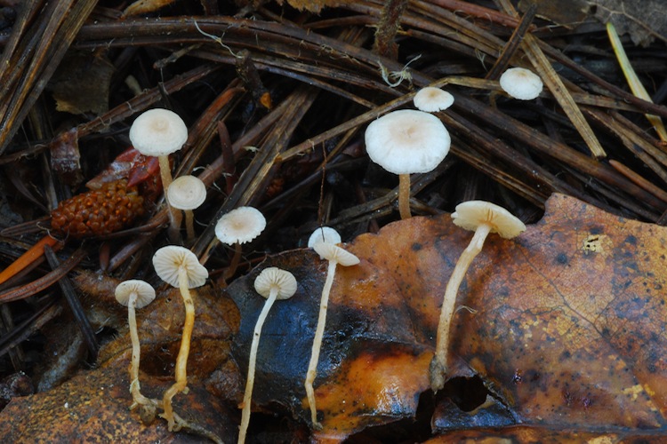


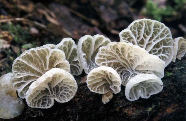


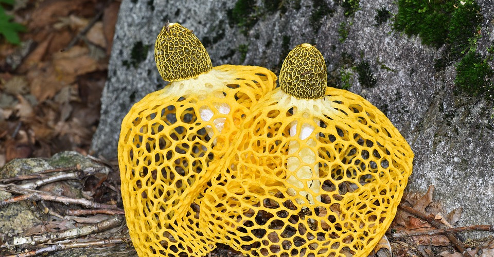

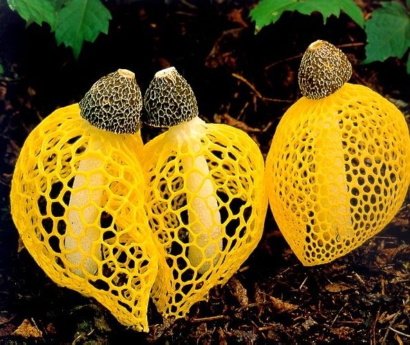


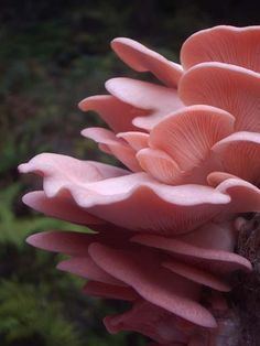
Lactarius Indigo, Ramaria Stricta, Hericium Erinaceus, Collybia, Campanella Caesia, Dictyophora Indusiata, Podoserpula Miranda
following my own interests and the influence of Brett Manning I want to take inspiration from nature when designing the characters, specifically the fey, of A Midsummer Night's Dream. I want to focus now even more on mushrooms as a source of this inspiration as they are something I love so dearly and they have such a wide rage of verity in colour, texture and shape, it will give me a lot to work with... maybe each character I chose to work with can be inspired by a different mushroom?
Primary Research : Mushrooms

Even though it's difficult to find mushrooms right now as their season has passed, they're still able to be bought in stores. I decided to purchase two types to make studies from and take pictures of: large, flat portabello mushrooms and smaller chestnut mushrooms. My favourite part of the mushroom is the gills so as the portabello has a large cap and very visual gills this is what I decided to focus on the most when looking at them.


Some picture I took of the mushrooms I was studying, I focused on textures and pattern that interested me as well ad the shape as a whole.


Some studies I did in posca pen, it was so fun to draw these and I really love how they turned out. Using traditional media was a nice change from the digital software I have been using so often recently. Nothing quite matches the feel of a nice, chunky marker pen on paper, I forgot how much I love creating something tangible.
Primary Research : Seaside Textures


After lockdown lifted I went to Chichester with my family on a walking day trip. I decided to use this as an opportunity to collect more research into natural textures, while on the beach I decided to look for oyster shells. They have always had fantastical connections to me as when I was little my parents told me that they where the toenails of sea giants... I though it was so cool but very gross. However, now I know what they actually are their textures and colours really interest me. The opalescence, the ridges and frills are so fascinating and would be fun to use an an influence in adding interest to my designs.

Putting out all the oyster shells I collected out to dry.
Communication : Genre

Before I start developing this project further I need to establish not only what kind of game it will take form in but also the genre it will be. Keeping the genre you are designing for in mind when creating characters is so important... even though a contrast can be very effective when used purposefully (see games such as Doki Doki Literature Club which is a horror game disguised as a dating simulator) having a mismatching design is generally not a good thing and can take away from the submersion of the player/viewer.
I was having real trouble deciding what direction I wanted to take as all my options sounded really fun and interesting. So, I decided to ask on my instagram what genres my followers liked to see combined with fantasy. As this project so closely lines up with my personal interests I knew that those who follow me on instagram would most probably share those interests with me and be part of my target audience. This is a really useful source of information for me to find out what would be the most successful pathway for this project, were it a real game.


After reading through the results it seems that the most popular answers were horror and mystery. This will be an interesting development from the original story as it is a romantic comedy, designing the characters to fit a different genre will be really fun. I think the combination of fey with horror/mystery will be really nice too... going back to their original dark roots in folklore.
Process : Character Design Ideas

To help start generating ideas I looked at some of the shapes and silhouettes formed by the mushrooms I looked at in my initial fungi research. I'm going to use these shapes as a starting point for my character designs so help create something unique.


With these designs I tried to stay loose and not worry so much about imperfections I wanted to just draw the first thing that came to mind when looking at the shape. It was a really fun and effective way to produce multiple character ideas to develop from. I think I want to do these a few more times to ensure I can develop from a design I really love. Out of the ones above I think my favourite are the top right and the bottom middle and right, maybe considering trying to use shapes and features from these in my next experiments will help to narrow down my thought.

Picking and refining more Silhouettes taken from my initial mushroom research.


I created another six designs from the silhouettes. My favourite of these is the bottom middle design, I like the elegance it brings, it is very queenly and I like that it helps to show her queenly status. The third eye I included is interesting too, when developing my ideas further I want to make sure that it encapsulates the horror aspect my target audience decided on.
Process: Design Development (face)


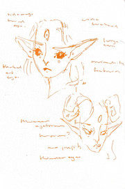


To begin developing these initial ideas I decided to first establish what Titania's face will look like. Faces are one of my favourite things to draw and design as it is so integral to how to character is read and perceived. I really enjoyed working traditionally again when drawing the mushrooms so I decided to start developing ideas in my sketchbook with freehand ink sketches. I found it quite difficult to work like this as I am such a perfectionist and unlike mushrooms mistakes in the structure of a face are much easier to spot. However, this made me think much harder about each mark I was making and helped me to consider things more.
I like the direction these are progressing in, however, I want to find a way to combine the eerie and the beautiful into one design...


I experimented further with face shape and looked at Liv Taylor as a reference for her features. I also continued to play with the horn size, from these I think my favourite in the smaller horns that curve around the top of her head above her ears. I think a longer, more oval face shape is a good direction to follow however I need to make she she doesn't look too young (bottom middle sketch is a good example of what I want to work towards).
Process: Design Refinement (face)

Here is my first attempt at refining Titania's face, I am having a lot of fun experimenting with non-human features, such as clear eyes and horns. I like how this is looking so far she looks scary but also etherial which is what I wanted from the beginning.
I want to add a little extra something to these designs to make them even more distinctive and unique. As well as looking at how the theatrical makeup could look with her design I was thinking of maybe also experimenting with markings? Maybe things inspired by nature or animals.
Process : Makeup/Marking Design ideas

These are some designs inspired by theatrical makeup I looked at during my research process, I like how these look and as perviously mentioned the idea of making reference to Titania's origins in theatre with my design.


After looking at theatrical makeup, I decided to experiment with a different influence. The above patterns were inspired by nature, namely flowers, leaves, vines and trees. I like the vine patterns under the eyes a lot as well as the rings descending from the top of the head, both are effective and simple but have very different effects.
Communication : Target Audience Creations

To get some insight into my target audience's opinions on the character design, I gave this template to some friends to fill out and add pattern to her face in a way that they would find interesting for a character in a video game, I also asked them to keep into consideration the genre of horror/fantasy. I found this process really interesting, seeing that my target audience would like more bold pattern on her face rather than the more delicate designs I have been producing is quite eye opening. Although pleasing my target audience is important, I still want to stay true to myself and my own aesthetics... Maybe I can find a way to combine both ideas into one design.
Process : Combining Ideas

For these designs I tried to combine the bottom left design from those made by my target audience with the ones I created in response to my research into stage makeup. My favourites from these two are the top left and bottom right, I think now to decide between them I need some more context, to see what fits best. In order to do this I am going to start the design process of her dress/outfit, body and colour.
Process : Considering Body Type
Before delving into the design process for her gown I need to think about what I want the body underneath the clothing will look like and how this will effect her silhouette as well as how she is perceived. What I am aiming for with my design of Titania is someone who has a regal, imposing and elegant presence (I also want her to be a little creepy though).

Something that came to mind when thinking about this is The Other Mother from the movie Coraline. What makes her design in this scene so scary is her disproportionally long limbs and stick like figure. I want to take inspiration from The Other Mother's design when drawing my Titania, but have it a little less extreme in so that she still looks elegant and regal. As I'm not designing her with the intent of being a villain I don't want the horror aspect of her design to be too strong as it could give off the wrong message.


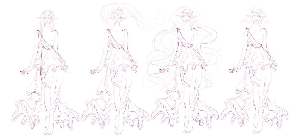
Process : Figure Design Development

Here is the process I went through while playing around with Titania's proportions, this was quite fun to work on, although I found trying to achieve what I wanted with her figure quite difficult... I think what I have developed this into so far will work well, she looks regal but also has something quite unsettling to her design as well.
I am not sure yet as to how much her outfit/gown will cover her body, so I won't develop it in too much detail. However, if it ends up that he body is very visible I will experiment with her proportions further. She will also most definitely have wings in the final design so this is another thing I should take into consideration.

Another reference I could take into consideration if needed is the withered from the game World of Warcraft the character above is powerful and elegant but also quite scary which is what I really want.
Primary Research : Ashmolean Statue Collection

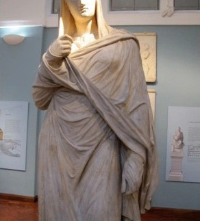


I want to include the influence of some ancient Greek and Roman statues in the designs I create for Titania, considering that the play is set in ancient Athens I want this to show through in my design, even if it's only a little bit. As inspiration for this I looked into the casts collection of the Ashmolean museum, it has a vast gallery of casts of both ancient Roman and Greek sculptures. Observing the silhouettes and styles in pictures I took during my last visit (before lockdown) was really inspiring for me.
Process : Costume Design Development

For these designs I looked at combining the designs I created in the mushroom exercise with ancient athenian fashion. I love the last design on the right the most, I feel it captured this combination really well and fits the fey character. I still want to develop it further though, maybe find a way to include more mushyroom textures, floral influences or pattern inspired by oyster shells.


These are some developmental ideas I created, I really love how these look, however, I feel they have lost a sense of wildness that the original design had. They feel more 'fashion' rather than something that comes from nature... However, there is a critique coming up and gaining the opinions of my peers as to which designs they like best would be very valuable.


Communication: Critique
Here is the PDF I presented for the critique, I only showed the developmental designs as to not have too many pages for people to look through. Although, considering how similar they look I treated the first design from these designs as the last one on the page from my initial ideas and kept this in mind when reading through the feedback.


Out of the people that commented on which design was their favourite, most said the first, third or both which is great as those two are my favourites as well. The first design is more carefree while the second is more reserved and regal... Something else that was commented on a lot is that the use of mushrooms as inspiration comes through clearly in my designs, wonderful! I was slightly worried that I had drifted away from this original concept so I am very glad that it still shone through.
I also had a tutorial during the critique about my progress so far and talked about the designs I had created. We both agreed after some discussion that the last design from the initial sheet is the strongest. Being told this by my tutor and also seeing all the feedback from my peers saying the one that is so similar to it is the best, I have decided this is the one I will be developing further.
Process : Costume Design Development

Above is a more finalised version of the design, I used the skirt from the second variation for the stop from the first. I wanted to experiment with some simple designs on the outfit, I'm not sure if I prefer any of these to how it looks plain but I want to try some more ideas with maybe some bolder/bigger pattern.

I did a little more research into ancient Athenian fashion, and found this really interesting illustration as well as some information about how their clothing was decorated and dyed.
'Fabrics were dyed by natural plants. The most common colours used for dyeing the clothing were violet, green and grey while materials were decorated in checks, wavy lines, stripes and flowered designs. Coloured clothing was always more expensive than plain.'
I want to take inspiration from these illustrations and information I have gathered when experimenting further with pattern, just to see if it is something I want to pursue in my design.

These are some experiments I made in response to my new ideas and research... I actually really like how these look, I was thinking it would look strange or out of place in some way but I think this looks quite interesting. My favourites are the two middle designs, I feel they keep to the nature inspired starting point in a way that helps convey her regal position even more. However, I'm not sure if I would prefer something like this to just a plain dress... the plain dress could look more like a mushroom but something with pattern could look more like a purposefully designed dress. I think for now I will continue the design process with the idea of a plain dress and see if it looks as if it missing anything when colour, hair and wings have been added.
Process : Hair Design

Although I had already given her a hairstyle in the initial face designs, I decided to quickly look at multiple different options for how Titania's hair could be styled, just to make sure I making the right decision...
I wanted her hair to covey the ethereal presence she should have as faerie Queen while also keeping the wild nature of her design... I love the idea of her having extremely long hair, my current two favourite variations are the first and second from the left on the bottom row. I think giving her hair a life of its own and having it float around her head as if it was underwater is so visually interesting and would really show her magical nature. However, having it very long and straight would give me more options for head accessories like a crown or flowers for example. I could also always have her hair posed like this depending on how Titania is positioned in the final outcome.
Process : Colour Palette ideas


These are my initial ideas for Titania's colour design, I took inspiration from the research I have collected so far such as the various different mushrooms as well as the colours of the woodland I visited initially when the bluebells are in bloom, I wanted her colour palette to be completely non-human so tried to stay away from colours that occur naturally in us. Although I love the vibrancy of some of these designs I think the ones that resonate with me the most and are closest to my vision are the ones in the last row. I want to develop from these palettes and experiment with different combinations of the colours.
Process : Colour Palette development


These are the designs I created based off my previous experimentations, I made them all quite pastel based as I decided that I want Titania's personality to stay true to the original story in which she is kind and loving - I wanted the colours I use to reflect that.
I absolutely love how all of these look, so it's going to be a really difficult decision choosing which one goes forward... to help with this I asked a few of my peers and friends (who would also be my target audience) which ones they liked the best. Majority answered with either one of the two designs that have white skin which I found curious as to me they were the ones that seemed the least interesting. The ones that draw my eye the most personally are the ones that feature green skin, I love how it connects her to the forest she lives in, also when I was little I would always draw faeries with green skin for some reason... so maybe it has a sense of nostalgia for me? The green and purple design also reminds me of the colours commonly associated with Dionysus, the Ancient Greek God of wine, fertility, theatre, and religious ecstasy. Having a reference to the Ancient Greek God of theatre in a character whose original purpose was to be in a stage production set in Ancient Greece could be something quite clever...
However, I could always incorporate this reference into the pattern used on her dress or the facial markings, for now I will do a little more research into the designs my target audience are drawn to by asking a wider selection of people.
Communication : Target Audience Colour Palette Research
Since Lockdown has been lifted I thought it would be interesting to conduct my Target Audience research in person this time instead of through instagram. Talking to people face to face about your work is so, so different and really important. Doing this research in person will also allow me to not only collect information regarding which design they like the best but also why they like it the best, this is very valuable to me as it will help me with future projects too.

This is the results of the survey I did of the opinions of my peers and tutors at university (please excuse the low scan quality). I'm surprised at how spread out the results were, actually, I thought that there would be one that everyone like above the others but this wasn't the case! However, the designs that featured white skin and hair were slightly more popular overall than the rest of the designs, the design with a green dress having 7 votes and the with the purple dress 6. Although the green dress variation has one more vote than it's purple counterpart I think I will move forward with the purple design anyway, as a comment a few people made as to their reason for picking it really stuck with me. They mentioned how the purple made her look more regal because of it's association with royalty, as Titania is supposed to be a faerie Queen I think it is important this aspect of her character is not forgotten... I'm so glad I did this survey in person as if I did it online I would not be able to get this level of feedback so easily.
Process : Design Development


Even though I didn’t end up choosing one of the designs with green in, I thought about how I would still be able to include a little bit in the design through the use of the facial markings I designed for her earlier, I am sure I want to include green because I think the reference to Di0nysus in her design is fun. Above are some tests I created in which I placed my favourite markings onto her face to see which one looks the best in context with the rest of the design. I also wasn’t to keep in find I will probably also be including the vine pattern onto her clothing so it can’t clash too much with that.


I experimented further with these two designs as I thought they would probably compliment the pattern on the dress the best, I also added a little more detail to her chest area as when I was painting the face details it felt a little unbalanced to have nothing there...Out of the two designs above, although it is close, I think I prefer the design of the vines ever so slightly more than that of the line. It really nicely ties her design to nature and also more effectively gives that wink to Dionysus that I was aiming for (God of wine, grape vines).
Process : Body Marking Development

After deciding on going forward with the vines I still felt the pattern was a little unbalanced being only at the top of her body so I decided to add a little more to her limbs too. I think this looks much better and makes her look so ethereal, I like having the vines get smaller the further down her body they go, its so lovely and delicate. I am very happy with how she looks so far, all I have left to do now is small details such as accessories and jewellery as well has her wings.
Primary Research : Insect Wings


As summer is approaching I wanted to try and take some pictures of butterflies and insect at Regents Park... but unfortunately I couldn't see any so I decided to draw from this scientific specimen display case that I have hanging in my room.


Studying these wings was really interesting, looking at all the detailed and unique patterns made me feel really inspired and excited to incorporate something similar into my design.
Process : Wing Design Ideas
In the critique a comment by my friend Trish actually mentioned the design of her wings and a suggestion for how they should look. She mentioned that I should consider trying to stay away from the traditional butterfly wing shape faeries are usually draw with and instead look at other insects such as dragonflies for inspiration, this would help the design to look less generic. I would definitely like to explore this idea as I was actually already picturing her with dragonfly-like wings, but looking at lots of different types of insect wing could help create some interesting concepts so I'm excited to see what I can find!


Before I created the design ideas I decided to do some more studies of moths, I watched a movie called Strange Magic in which the male faeries had moth wings and it looked so beautiful so I thought I would experiment with this idea too (as well as looking at other insects in the process).


I tried out lots of different wing designs to see what the best option for her design would be, I was really fun to see how this can change the way se is perceived and what personality it gives her, my favourites from these designs are 1st row left, 2nd row left and 5th row left. I feel that these look the most powerful and elegant which matches what I want for her design, although the other wing ideas are very pretty I feel these are more impactful.


Above are the insect wings my 3 favourite designs were inspired by. Although it's a very hard choice as I really like them all a lot, I want to work on being more decisive... So I have chosen to go forward with the moth inspired wings as I feel they are the most interesting and compliment her design very well, I like the idea of being able to mirror her third eye in the wing design... horror is something I took into consideration when making my decision. I felt the mantis and dragonfly wings could end up making her look too soft? Even though I have decided I want her to be a good character I think these give her more the edge that a horror game character would have ... I like that it takes the classic butterfly faery wings and puts a twist on them.
Process : Wing Design

I first looked into the moth wing design but now I see it in more detail I am not sure if I like it so much anymore... Although I think the patterns look interesting and I like the mirroring of the third eye on the wings I feel that the wings and dress pattern clash too much...I might look into the dragonfly wings as well just incase.

I am so happy I decided to tryout the dragonfly wings too because they look so wonderful, although they are also very detailed its much more delicate and subtle so doesn't clash as much... When choosing between the two designs originally I was worried the dragonfly wings would look too soft and not convey the horror aspect of the design I wanted. However I think they actually make her look more fierce and intimidating which is a good base to work off. I think now I can use her environment, backgrounds and facial expressions to more convey the aspect of horror - however - I need to make sure she isn't too frightening as I still want her to be read as a good character.
Process : Titania's Design - Final Details

To finalise Titania's design I decided to add some small details such and jewellery and a flower crown made of wisteria I really feel these small details have elevated her design I love how it looks. The process of getting to this point was long but I am so glad I was rigorous with each stage of design development, as I feel I have really achieved something I am proud of. Being able to fully take on board the ideas and opinions of my target audience as well as staying true to my aesthetic is really satisfying. What I want to do now is find a way place this design into a setting/environment that can fully display it in context.


Primary Research : Revisiting the Woods


Now that it is later in the Spring time I decided to revisit the woodland I went to at the beginning of this project to see if the bluebells had bloomed yet, and they had ! I was so excited to see that wonderful blue again, it never fails to make me happy - although not all of them had fully flowered yet so I might go back again in maybe a weeks time to see if I can capture them at their brightest, however, these will do if I am unable to. I wanted to re-capture compositions I could use as references to place my character in (as I did previously when there where no flowers) as well as smaller details and textures.


Some more detailed shots of the bluebells as well as some trees that caught my eye while I was walking.
Process : Primary Research Studies


I wanted to experiment some more with poscas, as I really enjoyed using them when doing studies of the mushrooms. I decided to look at the shapes and forms of the bluebells as an opportunity to play with this media a little more. I love how these pens create such bold, vibrant colour and they feel so great to use too. I'm so glad I took the opportunity to play with these again as it made me realise how much I missed it, I know now I want to find a way to return to my original roots in traditional illustration with this outcome while also utilising the strength of my digital work.
----------------------------------------------------------------------------------
Inquiry : Research Question
After working into this project and rediscovering my love for traditional media after 4 completely digital projects this year, I have decided on a research question the outcome of this project will explore:
Can a mixture of traditional and digital methods be combined to create a character concept piece that not only serves its purpose, but also is an artwork within itself?
This question is very important to me and my practise, I want to be able to find something that helps me make my mark and stand out among others who have the same goals. Looking to see if I can create something that uniquely combines my interests and passions into what is seen as industry standard will be so exciting.
----------------------------------------------------------------------------------
Process : Bookcloth Printing Test 1


To begin thinking about combining my digital work with traditional media I decided to experiment with printing onto canvas like material with and inkjet printer, I started by looking at using bookcloth as it is cheaper than buying treated canvas. This is the result from printing on a cream coloured, textured bookcloth (I printed a piece I created earlier for the Minor project as I am thinking of something similar for the outcome of this project). The colours are slightly more muted and yellow toned but I love the texture this has, I also think this hue adds a little more charm. It makes it look more 'handmade' and less like a photocopy that white paper would. Also, considering the subject matter of my outcome, I'm not sure a stark white and clean base/background would fit very well however I want to test it anyway just to see how it looks.
Process : Bookcloth Printing Test 2


I printed again slightly smaller onto some pure white bookcloth, just to see the difference between the two. Although the colour quality is better on this print I don't know if it has as much character as my first test, as previously mentioned I feel it looks too much like a boring photocopy and I don't think the slight improvement in quality is enough for me to change over. However, working into the two tests with traditional medias could change the way they are perceived completely and help to get rid of that stiff photocopy feeling... I will have to experiment further before I make my decision.
Process : Posca Markers on Bookcloth Prints

To begin my experimentation with the alteration of digital prints with traditional media I first decided to work into the piece with posca markers. This didn't work as well as I hoped as the book cloth absorbs the colour and it looses vibrancy because of this. This meant i could only work onto very light colours (like the skin) and still be able to see it. However, the white pen worked really well to bring out highlights in the print, even on darker colours, which is really great since the artworks loose their vibrancy a little when printed in this way. Something I need to consider when working in this way is that the posca markers bleed ever so slightly when applied to fabric so it would not be suitable for things where I have to work on precise detail unless I printed my outcome on a much bigger scale. I was thinking maybe an alternative could be acrylic paint on. a fine tipped brush.
Process : Nail Varnish Marbling onto Bookcloth prints

I next wanted revisit a technique I used in my Integrated project - Marbling with nail varnish.This was really fun to do and I think it turned out really well, especially the part that layers over the clothing, it surprised me how easy it was to control and create a sharp edge. I think the marbling in the top left corner also looks nice, it adds a surreal nature, like magic is dripping out of the piece itself. I am wondering if using this effect when creating some of the detail and texture on Titania's wings could be effective.
I also played around a little with some gold spray paint I found, I wanted to see how it interacted with the poscas and the cloth. It's very interesting to see that the poscas shine through the spray paint even in the places I applied it quite thickly. The blue even shone through which surprised me even more than the white which I was expecting a little because of the strength of the colour, I'm wondering if I could use this to my advantage to create some interesting effects.


Process : Having Fun with Stickers

What I wanted to next originally was experiment with some sewing into the cloth and adding texture that way... However, as I was looking for the sewing kit I found a bag of old stickers I had from when I was younger. A lot of them were nature themed so I thought it would be fun to use them on this piece just to see how it looked. I actually really like how this looks, the butterflies and smaller flower stickers are really cute and how they add and extra layer to surface of the cloth is lovely. The crystal flowers are very pretty too, I was thinking that considering this print is only quite small (dimensions) on the actual final piece they would be a nice way to add little sparkly details, as in a bigger composition they wouldn't be as in your face. I'm not completely keen on the large, pink paper flower stickers, but this could be due to the style or how I arranged them. I have some other more delicate looking ones that might look nicer, I could experiment with these on the larger off-white print later. I think finding a way to make these stickers more my own will also help them match better, maybe I can create something similar myself if time allows?
Process : Experimenting with Sewing +Embroidery


I wanted to experiment a little with embroidery but unfortunately didn't have any thread to hand. I tried to instead use some ribbon and knitting yarn, it was hard to use the ribbon as it kept fraying as I threaded it through the holes and didn't have a needle large enough to use. I think this could look nice but embroidery thread would definitely look better. I want to use this to highlight the body markings so I need something delicate, the knitting yarn could also look nice but similarly to the ribbon I think it is too chunky, I like the idea of the eye standing out more though but I don't know how I would do this without making it look strange or tack. I want to experiment with embroidery thread before I decide for sure if I am going to include this technique in my outcome.


I used some proper embroidery thread and i really love how this looks !! It is exactly what I was imagining embroidery could bring to this piece. I decided to try and recreate the markings i designed for Titania again to see if embroidering them onto the illustration instead of drawing them could be a viable option. I also decided to try and work into the yarn eye again to try and improve it a little and I think it worked out well, it looks much better than before but I still wont use this in the final. However, the embroidery looks really beautiful and I will definitely be using this in my outcome, maybe a darker shade of green though? But I do like how this looks... We shall see.
Research : Hades Concept Art

A suggestion made in the critique we had for this project was to look into the art of the game Hades as they believed it would match my project and style well. I knew about this game and had seen some of the art before as it has received a lot of hype recently, I have been meaning to play it...
Looking into the concept art was so interesting, the character design in this game is exquisite and such a beautiful mixture of ancient and fantasy aesthetics. Above is the art created for the character Thanatos, I think it was important for me to look into some professional concept art before creating compositional drawings for my outcome. In order to answer my research question I need to make sure that the positioning of the character not only looks aesthetically pleasing but presents her design in a way that is clear and legible, as concept art should.
Research : Hades Game Art - Dionysus


Continuing my research into the game Hades I decided to look to how the artists for the game positioned characters for their in-game portraits, I chose to look into Dionysus specifically as his legend was one of the inspirations for my design of Titania. I love the laid back and effortlessly sensual nature of his pose here, it is wonderful and shows his personality really well. I want to be able to something similar with how I present Titania, maybe considering a reclined or semi-reclined pose is the way to go forward here, as it is also a great way to show off her design without it seeming too stiff.
Process : Life Drawing


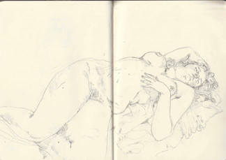

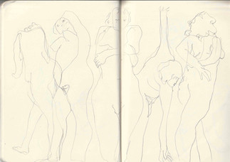


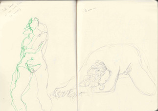


To help get some ideas for the compositions and to practise drawing various poses I decided to join a life drawing class. It was really great todo some life drawing again, it's so important for me as a hopeful concept artist to progress my drawing skills and I have really missed it a lot! I was hoping that we would do some more reclined poses so I could reference them in my final piece but unfortunately we only did one. However, the pose we did is so beautiful and I definitely want to see if I can use it.
Realisation : Compositional Ideas


Here are three compositions I designed for my final outcome, I love them all a lot and think any of the three could make a strong piece but I think I know which one I will take further. After some discussion with my tutor I have decided that I will go forward with the second composition. I love that it draws from my primary experience in life drawing and I think it is the design that best combines artistic posing with that of concept art. I feel the first idea is too rigid and basic to be an interesting art piece while the second is too curled up to fully display all the detail that has gone into her design. I also love the idea of working onto a landscape canvas, it is something I haven't really done before and should be fun for me ! I also think it is a lot less predictable for a character concept portrait to be done landscape which I like.
Something else I discussed with my tutor was the use of tracing paper as a method of adding texture to the wings. I wasn't 100% about this as I was worried that it could end up getting crumpled or tripped and make the piece look tacky. This is exactly the opposite of what I want, I need this piece to feel opulent and glamorous as Titania is royalty and I want that to shine through. We instead discussed the idea of exploring resin as a way to ad a sheen to them and some interesting texture. I have used resin in my art before so this is something I am familiar with. However, keeping in set to a specific shape could be difficult and I might need to find a way to make some moulds.
Realisation : Collecting Reference Images


As I will be using wisteria as a main component of this composition I decided to take some of my own reference images to use in the painting process. Further down the road I live there is a house that has a beautiful wisteria plant blooming currently, which is a perfect opportunity.
Realisation : Digital Painting Process


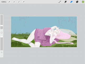


Above are screenshots I took throughout the painting process of my Final Outcome. I really enjoyed creating this piece, it was very challenging for me as it made me explore different techniques and painting styles I haven't tried before: such as that of the grass. Painting a more complex pose and shading her clothing was also an excellent learning experience that pushed me out of my comfort zone. I really love how this turned out and I am very proud of it.
However, I had to make a few changes to the composition and process along the way, such as: deciding to not draw on her markings but instead embroider them directly as to make sure it doesn't look messy. I also decided to not include her flower crown in this piece, as it took away from the simplistic beauty of her face and made her head seem a little cluttered along with the horns. Finally, I also decided to work into the detail on her wings traditionally with gutta or something similar, as a way to contain the resin!
A time lapse of the painting process.

Realisation : Inkjet Printing Process


The next step in the realisation of my outcome was to print the piece onto book cloth so I could being to work into it traditionally, above is the process of this. I decided to print onto an A2 piece of paper as although a3 worked for a square canvas I was worried it would be too small for a piece with these proportions, I also printed twice to be sure I had a backup if anything went wrong while working into the piece traditionally. I am so happy with how this looks, I was worried about the colours looking dull when printed onto cloth or the painting style looking strange when blown up but I think it looks absolutely wonderful. I am so excited to take this further to create my vision, but honestly I love it so much that I would even be proud to display it as it is now.

A scan of the print.
Realisation : Embroidery


To begin the process of working into this print digitally I decided to start with embroidery. I found this a little challenging and made a few little mistakes such as having the leaves on the arms facing down instead of up. I also wanted to make sure each stitch was the same size (except as it gets smaller further down each limb) which I messed up a little on the face, however, it still looks nice and I'm very happy with how it turned out !! I think this adds so much interest to the piece already and I'm excited to see how it develops as I take things further with traditional techniques. I next want to work into the wings and jewellery with resin and gold gutta.
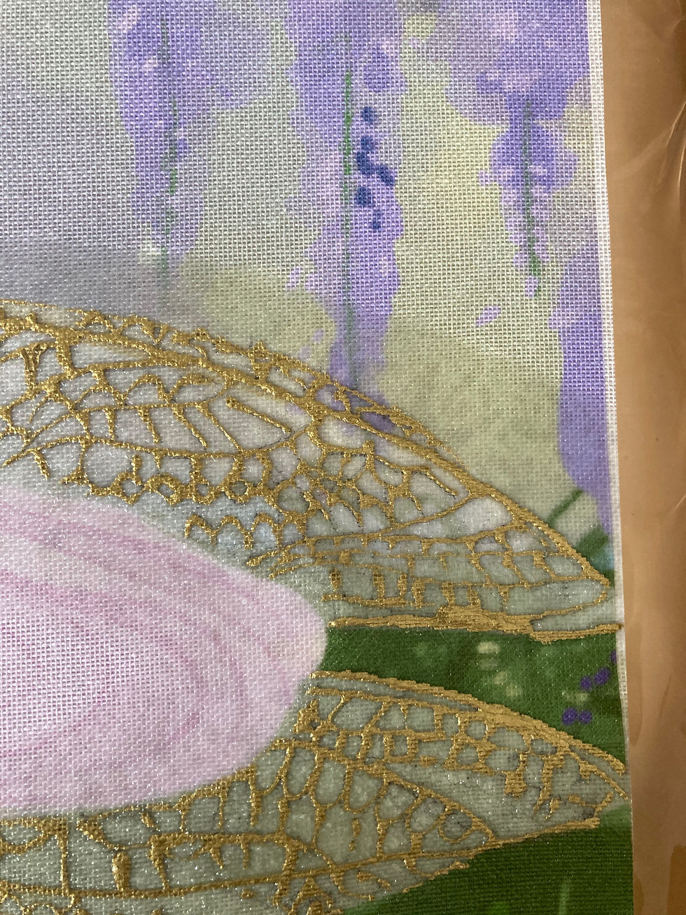
Realisation : Gutta


I am so happy with how the gutta details turned out!! It was actually the part I was most worried about going into this process, but I love the result. The wings sand out so beautifully now and the little gold jewellery pieces scattered across her body really help the piece to pop.
To make sure I was able to control the flow of the gutta I marked out the pattern of the wings with pencil beforehand and did a few test strokes on some offcuts of the book cloth as you can see above but it was surprisingly much easier than I remembered... I think this is because the last time I used Gutta I was quite little. I now need to wait for the gutta to dry so I can set it with an iron and begin the process of incorporating resin into my outcome.


Setting the gutta with an iron.
Realisation : Testing out Stickers


while waiting for the Gutta to dry I decided to test out the placement of the little jewel stickers I experimented with earlier on in the project... Although I do like them and think they're very cute I decided to not use them in this piece as its away from the soft and dreamy aesthetic, I also feel it makes it look less professional.
Realisation : Resin Gloss


I decided to paint the resin onto the wings using a small paint brush to make sure it got in the areas I wanted, I think this glossy effect looks so beautiful and I really like what it adds to the piece, unfortunately it seeped a little outside of the wings but nothing too detrimental.. I will wait overnight to see how it looks when it dries.
Unfortunately while it was drying overnight the resin seeped a lot more... I feel silly for not testing this on a scrap piece beforehand but I was so sure it would work, just a stupid mistake really. However as the resin isn't coloured I think this piece is still salvageable. I was thinking about maybe working into the areas in which the resin seeped into with acrylic paint? adding some texture so the wisteria could look really nice and add some beautiful dimension to the piece.

The resin seeping also caused this very strange spotting texture in the hair.... I could try and paint over this as well but I am worried it will ruin the balance of the piece and put too much attention to the right had side of the painting, but I guess I don't really have a choice...
Realisation : Painting

I started to paint over the hair using non-watered down watercolour paints to try and keep the softness of the original print and a more matte finish. However, even though I believe that this could look really lovely if I put enough time into the piece I feel it would take long to follow this route rather than just redoing the embroidery and Gutta. Since this wasn't the original vision I had for the piece I will just take the time to redo rather than trying to salvage this version. It's such a shame as I loved how it looked so much I hope I can replicate what I did again... I'll be using this version to try out techniques before doing them on my second attempt.
Realisation : Nail Polish


Before trying the nail polish on my outcome I decided to test it on the one I missed up to make sure it wouldn't seep. I tried in 3 different places (it is hard to see from the images) and it only seeps a little if applied to liberally. I found the best method to stop his from happening is to first apply a thin layer then a thicker layer on top of that once it has dried. This means it doesn't seep but still has a glossy texture.

This is how the wings looks after the first coat, I was so anxious about applying this that I almost backed out and left it as it was... but I am so glad I decided to go forward with it as it is already looking so beautiful, the varnish really helps the gold to pop.

This is after the second coat, this difference and sheen is a little difficult to see in an image so I have linked a video below to better show how it looks:
To see a continuation of this project please follow this link : https://natashamakins.wixsite.com/natashamakins/post/fmp-pt-2


Comments