
Penguin Book Cover Competition
- Natasha

- Feb 26, 2021
- 10 min read
Updated: May 23, 2021
*Closing date for entries – 14.00 GMT on Tuesday 23 March 2021
What the judges are looking for:
We are looking for a striking cover design that is well executed, has an imaginative concept and clearly places the book for its market.
While all elements of the cover (front, back and spine) need to work together, remember that the front cover has to be able to work on its own, and to be eye-catching within a crowded bookshop setting as well as on screen at a reduced size for digital retailers.
The winning design will need to:
have an imaginative concept
be an original interpretation of the brief
be competently executed with strong use of typography
appeal to the broadest possible audience for the book
show a good understanding of the marketplace
have a point of difference from other books that it will be competing against in the market
be able to sit on the shelves of a supermarket or ebook store as easily as it sits on those of more traditional bookshops
Enquiry: Mind mapping


To begin I decided to look into two of the book available - the children's fiction Talking Turkeys and the non-fiction The Uninhabitable Earth. I made a mind map for each of the books so that I could start generating ideas for them. Collecting imagery that inspires me, listing subject matter I could explore and methods I was to try out.
After creating these I realised that I the talking turkeys book wouldn't really suit my illustrative style/ aesthetic and would look out of place if I wanted to use it in my portfolio, so I decided to pursue the non fiction choice The Uninhabitable Earth. Even though it is not as out of my comfort zone as my outcome for Talking Turkeys would have been, it still is pretty out there. I am so used to creating my work to narrative with characters and a plot that creating something for a non-fiction book will be an entirely new experience for me.
Primary Research: Reading/Listening to the Book
The Uninhabitable Earth: A Story of the Future by David Wallace-Wells
'In crystalline prose, Wallace-Wells provides a devastating overview of where we are in terms of climate crisis and ecological destruction, and what the future will hold if we keep on going down the same path. Urgently readable, this is an epoch-defining book’ – Guardian
The Uninhabitable Earth is both a meditation on the devastation we have brought upon ourselves and an impassioned call to action.
As I had to start reading the book before my previous two project were finished (because I had an extension) I decided to get an audio version of the book to listen to while I worked. I found the book very interesting, the way Wallace-Wells writes is spectacular and it is such an eye opening book, it is kind of terrifying to think how much our lives will differ in the future without a revolution against climate change now. While listening I also made note of quotes I liked or found interesting so that I would be able to look back and use them as a reference when designing.
'It is worse, much worse, than you think. The slowness of climate change is a fairy tale, perhaps as pernicious as the one that says it isn’t happening at all, and comes to us bundled with several others in an anthology of comforting delusions: that global warming is an Arctic saga, unfolding remotely; that it is strictly a matter of sea level and coastlines, not an enveloping crisis sparing no place and leaving no life undeformed(...)'
'Humans, like all mammals, are heat engines; surviving means having to continually cool off, as panting dogs do.'
'Climate change is fast, much faster than it seems we have the capacity to recognise and acknowledge; but it is also long, almost longer than we can truly imagine.'
'A state of half-ignorance and half-indifference is a much more pervasive climate sickness than true denial or true fatalism.'
'We are only just entering our brave new world, one that collapses below us as soon as we set foot on it.'
'Seventy percent of the energy produced by the planet, it’s estimated, is lost as waste heat.'
'It has become commonplace among climate activists to say that we have, today, all the tools we need to avoid catastrophic climate change—even major climate change. It is also true. But political will is not some trivial ingredient, always at hand. We have the tools we need to solve global poverty, epidemic disease, and abuse of women, as well.'
'The zoos are already natural history museums, the children’s books already out of date.'
Research: Current Book Cover

To begin my research into book covers I decided to firstly look into the current cover for The Uninhabitable Earth. I love how simple it is, the creamy white with the muted colour of the bumble bee look so beautiful together and create a wonderfully impactful image. It is straight to the point and conveys the message of the book easily and effectively. Going forward I need to consider if I want to keep this minimalist aesthetic in my cover or give them something completely new and different.
Research: Other Books on the Market

One of the things that the judges are looking for in the competition is something that 'have a point of difference from other books that it will be competing against in the market'. As I can't go into a book shop at the moment because of lockdown, in order to better inform myself of other books of a similar subject matter I googled 'non-fiction books about climate change'. These are the covers that came up from my search. It is interesting to see the covers this book will have to compete with. They have similar running themes... they usually incorporate photography and graphic, vibrant typography. I need to consider these designs when creating mine to make sure that I do not create anything similar to what is already in the market.
Research: Penguin Classics

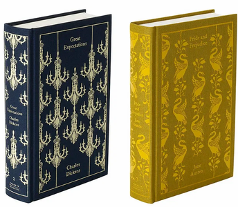


A collection of book covers I have always loved are these penguin classic ones. They are so beautifully designed and elegant. The illustration is wonderful and I love how each cover gives reference to an element in the story that you would not necessarily know about unless you read the book before. Considering these are classics it works very well and the name of the book almost speaks for itself, I am wondering if something like this would work for a non fiction... As it doesn't have a 'story' necessarily it would be an effective way to convey the issues the book discusses. I will have to experiment.
Research: Lang's Fairy Books


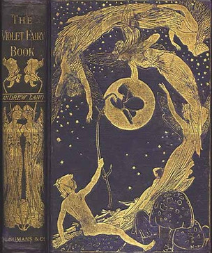
Another series of book covers that I have fallen in love with is the original series of the Lang's Fairy Books. Each book is assigned a different colour and has a beautifully intricate illustration on the front, with the title of the book only on displayed the spine. They are like little treasures, it is such a stunning collection and I hope one day to own one of each colour. I think taking inspiration from the layout of these book designs could be very interesting and different. I might need to modify them a bit to have the title of the book and the author displayed at the front so as to not break from traditional layout too much and be viable for digital readers, but I still think this could be the starting point of something very beautiful. I think this would also be interesting to have this fairytale style book cover as it relates well to one of the quotes I picked out... 'The slowness of climate change is a fairy tale...'
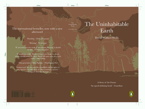
Process: Design Ideas

The design template we have to use for the book cover. I used this as a reference when I was creating these concepts.

These are four concepts I created in response to my research. My two favourites out of these are the bottom left and the top right. I love how the image flows across the cover and I think it would create a very impactful and unique composition. I think with these two compositions I would have to make sure I only use two colours - like in the Lang's Fairytale Books.
Communication: Critique

In the critique for this project I displayed my found current concepts to my classmates and asked for opinions on which one they liked the best and stood out the most. After a vote it was tied between my two favourites, the bush fire composition and the building composition. Although it doesn't necessarily help me make a decision as these are the two I favoured anyway it is nice to have affirmation in my choices and that others like them too. I think now going forward I will develop the both of these to a semi-realised stage and decide which one is best from there.
Primary Research : Regent's Park


To help practise drawing trees for one of the designs I have decided to take forward I decided to visit Regent's Park and do some studies of the flora there. I wanted to focus on finding a way to simplify their forms while still keeping a semi-detailed style that clearly shows what my subject matter is.
I am happy with how these illustrations turned out, working in pen made me think more about where each line would go and how I could create depth and contrast with one colour, it was a fun challenge. I think though, to create a more striking and clear image that working with silhouettes in my design would probably work better in this case as it would be more legible and not detract from the text.
Primary Research : London Skyline


Luckily enough, only a 10 minute walk away from where I live there is amazing view of Canary Wharf's Skyline from across the river Thames. I thought this would be an amazing reference for the skyscraper composition, I decided to go for a walk there with my sketch book and spend a little time just studying the shapes of the buildings I could see.


It was really interesting to spend some time looking at and drawing buildings as they're not usually something I pay much attention to (unless it's something like a beautifully ornate church). Although these aren't the best drawings these will still be really useful to me when developing my composition, as it gave me a chance to think about how to simplify the shapes and details.
Process : Design Development

This is the first of the two covers I produced, I really love the colours in this I think it is very impactful and would stand out well on a bookshop shelf as well as in a e-book catalogue. I also think the vibrant red conveys the overall message and themes of the book too: danger, death and destruction. I think this also effectively shows a connection to the Lang's fairytale books, in a way that is still true to my own style.

This is the second of the two I produced, this cover is really sleek and professional looking. I really like it, its very different from anything I have produced before. A part of this design that I think works well specifically is the fume tower going up the spine, I like how the whole story of the image is revealed as you look over the book as a whole. Without doing this, the smoke seems to be only clouds. Even though this is effective for a full spread, it causes a problem when we consider the e-book catalogue, this is because only the front page of the cover will be displayed. It is part of the brief set by the client that the cover I design not only works as a cover for traditional books on bookshop shelves but also for ones in an e-shop, meaning that this design would not meet the brief.
Because of this, as well as an unanimous opinion when asking friends and peers, I will be developing the first design depicting a forest fire.
Process : Colour Experimentation


To make sure the colour palette I was working with was the best one for this cover and the message I am trying to portray I decided to experiment with the hue and saturation of the design.
These four are ones that stood out to me while experimenting, I really like the bottom two in particular. The dark blue reminds me of a dark night sky and the brown of a barren wasteland. However, even though I like these covers I feel that the initial red and gold design is the most impactful. It is bright, eye catching and conveys the idea of danger the best out of all these options.
Process : Type Experimentation


Before deciding on using a pre-designed font I decided to test out if using hand written type would work better for this cover, I also looked as different brush ideas such as maybe using one with a slightly chalky texture to suggest the idea of smoke. However, I think hand written type for this project blends with the illustrative style too much which reduces the legibility, I also feel that this doesn't match the mood of the text as well as a more serious font does.
Process : Design Development

When looking at the design I was thinking about how I could push the communication a little harder that the place you're depicting is barren, I think the gold tone I used could be developed further as a means of bringing the eyes around the cover to the back.
I added some more shading and lines to the front cover in order to add more interest and depth and bring the eyes across the page more. Then at the back I wanted to add something more major. I was thinking about how I could incorporate some more symbolism relating to the ideas in the book, specifically suggesting death or destruction. I thought of a subtle skull forming in the smoke from the wildfire, nothing too obvious in order not to look tacky but something someone who looks more closely would be able to notice.
Realisation : Outcome


I am really happy with how this project turned out, I think my outcome is impactful and would stand out on a bookshop shelf. I found the process of creating this outcome a little difficult because it was so out of my comfort zone but I am proud of what I have achieved and how, even though it is very different to my usual work, it still stays true to my style and visual identity without compromising the message of the book. If I had more time on this project I would’ve loved to experiment with gold leaf and embossing but unfortunately as this is only a short brief this will have to wait for another time. I enjoyed my time exploring book cover design and might revisit this again during my career or free time as it is something I never thought I would like so much...


Comments