
Minor Project
- Natasha

- Oct 21, 2020
- 34 min read
Updated: Mar 2, 2021
'Your Assignment In the Minor Studio Unit you will be required to consider the planning, management and dissemination of a body of work based on areas of interest to you. You will consider your own motivations, aims and objectives in formulating a scheme of study. The Minor Studio Project(s) will encourage you to develop your personal working methodology to explore conceptual themes that resonate with you and/or the discipline(s) and visual processes that define your practice as a contemporary image maker. In this unit you will focus on the synthesis of a body of work that can be assessed academically and be taken into the creative industries or towards postgraduate studies after you graduate. You will be supported in generating a plan to position yourselves professionally and in developing an individual portfolio of work'
Enquiry: Mindmapping

Enquiry: Things that have inspired me over the summer
Craft

Over the summer I discovered the artist Honeylambs on instagram. They create unique and slightly disturbing (but cute) soft toys from old ones they find in charity and second hand shops as well as designing official toys that are restocked every few months (the rabbit pansy shown here is one of them).
I love the aesthetic they have produced for their brand and especially the concept of creating something new and special from pre-loved items... However as I am already considering to produce something in 3D for my integrated project I think the direction I want to progress with this one is in the 2-dimensional areas of design. I still want to be able to incorporate some aspects of Honeylambs' work into my own, though. Maybe through their use of colour and lighting or creating something new from an old idea, concept or object.
Animation
A source of inspiration for me, ever since I started playing it when I was 10 or 11 years old is the game World of Warcraft. The massive and engrossing lore helped me to discover my passion for high fantasy narratives since a very young age. I have always been obsessed with the idea of fairies and elves and monsters and experiencing this game only fed that obsession.
In preparation for a new expansion to the game Blizzard released a quartet of animated shorts entitled Afterlives. Above is the last of the four they released. I love this short so much, the impactful narrating and voice acting with the contrasted imagery of suffering, the lighting, the facial expressions, the music ! Everything about it excites me and leaves me wanting more.
I also really like this style of animation, it is simple but effective and helps to tell a longer story using less frames. Taking inspiration from this if I wanted to do an animation as my outcome could be something very beneficial to me. After extended periods of drawing I get extremely bad repetitive strain injury which causes me a lot of pain. This is a reason why I have shied away from orchestrating my work and ideas into animation. Using this method of animation would help with this problem as it focuses more on producing a smaller amount of high quality frames and editing them together in a skilful way that gives the appearance of lots of movement.
Music
Something that I find always inspires me, wether I realise it or not, is music. When I find a song I really love I find myself listening to it on repeat imagining an animation to accompany the lyrics. This song in-particular is one that I have found myself replaying over and over. It provides beautiful imagery of sunlight beaming through 'paper thin' curtains and childhood scars. Each lyric is filled with love and adoration, it is such a beautiful song.
Artists on Social Media


I like to take an almost journalistic approach to my social media, especially when it comes to finding things that interest and inspire me. This is a few screenshots of an instagram album I have been curating for a couple years now. I love looking back through it to see how my interests and aesthetics have changed and its a valuable resource for me to look back to whenever I feel creatively blocked or need inspiration. These screenshots are of the most recent posts I have added to the collection, I can already see a clear trend within these posts.
Very character based and most of them are portraits
Light, Pastel colour schemes with some use of strong blacks mixed in. Use of pink a common theme.
Colour block backgrounds.
Mostly digital art

It's funny as when I looked at these themes I thought about how they actually described my own feed on my illustration account. I guess I need to consider if I want to stick to these themes or if I want to move away from them... I'm really not sure yet.
Movies

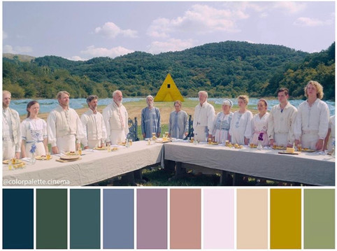
Wes Anderson is a creative I always seem to look back to for inspiration, even from some of my very first projects in GCSE and A-levels. More specifically, his movie The Grand Budapest Hotel. During quarantine I watched this movie an endless amount of times just to be able to look in awe at it's stunning colour palette and beautiful direction. I realised after listing the reoccurring qualities of the works I had saved into my album that its influences still shine through, especially with how I look at colours and composition.
Something I have been interested in exploring with this project, as seen in SSP 2, is a horror story. I was thinking of how it would be really interesting to explore this genre while using a light, pastel palette such as this. I don't think it is something that has been done many times before and it could be something very interesting way to explore outside of my usual subject matter but also sticking to the aesthetic I have developed over the years.


I decided to research a bit further into horror movies that use a pastel pallet. Midsommar was one that I looked into.
The light and fresh colour palette combined with the horrific gore and blood creates an unsettling atmosphere that is really interesting, it makes me excited to explore this idea of horror with an unorthodox colour palette.
Enquiry: Looking Back at Previous work
Looking back at my SSP2 project when I started to look at the idea of horror. I broke away from my usual style and use of colour to create this piece, which is a storyboard. When looking back, it makes me think about how it would be interesting to explore this narrative or something similar through the use of the colour palette discussed above.
----------------------------------------------------------------------------------
Research Question and Brief
Can a Classic Horror Story be Told using a Pastel Palette?
Area of research:
Narrative,Storytelling, Horror, Colour Design, Atmosphere Design
Project title:
Horror Through a Pastel Lens
How the project relates to and builds on my areas of interest and strengths:
I have always been interested in narrative, it is what inspires me to create and is something I want to do in the future. The nature of this project will also allow me to explore other areas of interest such as character design and environment design, which will be really helpful in developing a portfolio to go into the concept art industry.
I personally feel that I am a strong colourist and storyteller, so having a project in which the storytelling relies on tactical use of colour plays well into these strengths.
BRIEF
Using a majorly bright and pastel colour palette, reinterpret a horror narrative through the creation of concept art for an animated movie or TV series.
----------------------------------------------------------------------------------
Research : What is Concept Art?
To better grasp how this project should progress I decided to first fully inform myself what is expected of a concept art project... Industry veteran James Pickthall says: 'The main goal of concept art is to convey a visual representation of a design, idea, and/or mood for use in films, video games, animation, or comic books before it is put into the final product. In other words, it aims to convey the overall design vision rather than specify everything in exact terms right at the start.'
I want to keep this in mind when developing my project. I am not developing a 'final product' per say but rather, creating an atmosphere and vision for a project.
Research : The Uncanny

still from Alita: Battle Angel
'Sigmund Freud's essay The Uncanny (1919) however repositioned the idea as the instance when something can be familiar and yet alien at the same time. He suggested that ‘unheimlich’ was specifically in opposition to ‘heimlich’, which can mean homely and familiar but also secret and concealed or private. ‘Unheimlich’ therefore was not just unknown, but also, he argued, bringing out something that was hidden or repressed. He called it 'that class of frightening which leads back to what is known of old and long familiar.' (from the Tate Modern)
Exploring the idea of the uncanny in this project really intrigues me... I feel it is an interesting way to add an aura of unnerve to any narrative when the scene isn't outwardly scary. This would be a very useful tool for building an atmosphere for a horror story, especially when the colour palette is working against creating that creepy feeling. I think combining the uncanny with a pastel theme will create something quite unsettling, similar to what Honeylambs has done with their work.
Artist Research : Maxfield Parrish


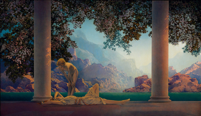
Maxfield Parish is an artist famous for his beautiful landscapes and harmonious use of colour. I love how he draws fabrics (seen in the piece on the left Jason and his Teacher ) and how the landscapes fade into the background... The pastel mountains in Daybreak (right) work well with the ideas I want to explore with this project. When thinking about working in a pastel palette, the background is what worried me the most as it is pretty easy for me to make a human and their clothes pastel but trees and paths etc is something I have never done before. This will be a good reference.
Artist Research : Tim Burton

still from Sleepy Hollow
Tim Burton's work is a source of inspiration for many creatives around the world, me included. His visual style is instantly recognisable and ionic; Be that in both his live action and animated features. Out of all his wonderful films the one that I would probably call my favourite is Sleepy Hollow. Maybe a more unusual choice? I'm not sure... But what I do know is that I love this film. The costume design, the score, the set design, the casting, all so wonderful. I have watched it too many times to count and have strong memories of watching it at 5am while working on A-levels as it never failed to keep me awake.
This film also has a sense of the uncanny. Especially with that of the design of the Headless Horseman, most specifically when he regains his head. His unnaturally coloured blue eyes and terrifying filed teeth create a striking design that is difficult to get out of your mind when you are trying to sleep on a dark and stormy night... I find it very interesting how Burton was able to create this sense without using CGI to alter features/proportions, just adding two 'unnatural' features to an otherwise normal looking face is just as effective. I want to experiment with this idea in my designs.
The story of the Legend of Sleepy Hollow itself also fascinates me. Originally a gothic novel by the author Washington Irving, it is a timeless tale that has had a large impact on pop culture through its figure of the headless horseman. There have been many interpretations of this character... Tim Burton's just being one of many. Maybe it would be interesting to create my own?
Artist Research : Arthur Rackham


An illustrator that I love who tends to use more pastel palettes is Arthur Rackham. He has been a favourite of mine for a long time, ever since i found out about his work during my GCSEs. His style and use of colour has been very influential in the development of my work and style. I know he was a very popular book illustrator so I was wondering if he did any work based on The Legend of Sleepy Hollow, I did some research and found these he produced illustrations for a 1928 version of the novel. Seeing the story presented in a lighter colour scheme is very interesting. I'm so used to seeing Burton's dark, desaturated version that seeing it in this way makes it feel like a completely different narrative. If I were to focus on this story I would want to go even brighter and more saturated.
Research : 1820s Fashion
My growing interest in the story of The Legend of Sleepy Hollow attracted me to researching the fashion at the time it was written so I could have a better idea of the aesthetics I would be working with if I wanted to design characters inspired by the writing.

For this research I intended to go to the V&A to see some pieces of 1820s clothing in person, but unfortunately because of Lockdown this won't be possible for some time... so I will just have to use secondary sources for now. I decided to look at the V&As online collection.


image credit : The V&A
These two dresses from their collection caught my eye the most, the left is from 1818 and the right from 1828. I love the sleeves on these dresses and the layered skirts, they make such interesting silhouettes.
I also looked at the V&A introduction to 19th century fashion. It talks about: popular hairstyles at the time, men's fashion, the desired silhouette and the use of corsets.

https://www.mimimatthews.com/2015/11/23/the-1820s-in-fashionable-gowns-a-visual-guide-to-the-decade/
Process : Character Design - Katrina Van Tassel initial ideas

I looked at 1800s portraits and experimented with different face shapes and features to try and create an interesting design. I really like the faces of 1 and 3 (left to right) but I personally imagine Katrina with a more soft and youthful look (probably influenced by Burton's presentation) so I think i will be developing 4 or 5 going forward.

Character design development sketches, clarifying her features and hairstyle. Inspired by face 4 and 5 from the previous experiments.

Initial outfit design ideas. I decided to keep the same iconic 'empire' waitlist silhouette of which was fashionable at the time. As Katrina Van Tassel is the daughter of a rich family she is able to have quite detailed and extravagant clothing, which made these outfits quite fun to design.


As these were designs I produced while waiting for my copy of The Legend of Sleepy Hollow to arrive I had to make them based on small snippets of descriptions I could find on the internet and other artist renditions. However, my copy arrived and I read through it, highlighting important descriptions and scenes that interested me. Above is Irving's description of Katrina. Now I have the full image of her in my head I can make a few adjustments to her previous design.

a painting depicting a typical 1700s silhouette
As Irving describes Katrina wearing a dress that combines 'both ancient and modern fashions' I decided to introduce some ideas from outfits of the previous century into her design.

He also describes her as wearing Jewellery that her Great-great-grandmother had brought over from Saardam (the name of a ship owned by the Dutch East India company). I looked into fashionable Jewellery in India at this time also and deducted that he was most probably referring to bangles or earrings.


Experimenting further with pattern for her dress. I can't decide which one I like the best so I decided to put it to a vote on instagram, as this gives me direct communication to my target audience. A group of people who are interested in art, character designs and concept art.


After leaving the vote open for 24 hours these were the results. It seems 2 and 4 were the most popular designs. People who I talked to said they liked 4 over 2 because it had a plain element to to it. Maybe I can combine the more detailed floral pattern from 3 with the plain top part of 4 to reach a happy medium.
Process : Character Design - Ichabod Crane

Various portraits of men from the 1820s
Before I started designing Ichabod I decided to look a little further into men's fashion of the time so I had better context to make an image of him with.

This is the extract from The Legend of Sleepy Hollow that describes the appearance of Ichabod. Irving describes in detail his facial features and body type but doesn't focus so much on his clothes, so I will assume they were of usual fashion for the time.

As Ichabod's features as described in quite an amount of detail I did not have as much space to experiment with them as I did when designing Katrina. For these I mainly played with the shape of his face and shape of his ears. My favourite is probably 2 or 3 (left to right).


visual references for period hairstyles

Character design development sketches, clarifying his features and hairline. Inspired by face 3 and the eyebrows of 2 from the previous experiments.


Playing with pattern on different pieces if his outfit to add interest and improve readability ... I think my favourite is the striped waistcoat as it breaks up the top part of his design quite nicely while also keeping his design modest; as his is a school master not a wealthy merchant.
It was a lot easier to design Ichabod compared to Katrina as I found that the men's fashion of the time was a lot less varied and more plain compared to what the women wore. Especially considering this story is set in a small famers town - the fashion would not be as extravagant. I need to make sure that I have a good amount of design differences between Ichabod and Brom so that they are distinguished easily (even just by Silhouette) without straying from historical accuracy.
Process : Character Design - Brom "Bones" Van Brunt


This is the extract from The Legend of Sleepy Hollow that describes the appearance of Brom. The way Irving describes Brom's attitude makes me imagine him a proud man that is fashionable and takes good care of his appearance. To distinguish him from Ichabod I want to make his silhouette much larger and broader as well as having his clothes be more extravagant.


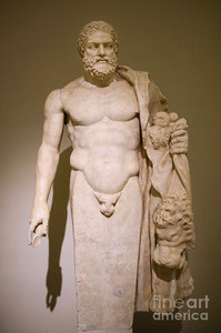
left: The Farnese Hercules right: Hercules by Marco Ansaloni
As inspiration for Brom's features I decided to take the text quite literally in when it says he had a 'Herculean frame...' I thought it would be interesting to look at Roman sculptures of Hercules as a basis for his features, he is even depicted as having had curly hair, just like Brom !

Some studies from statues of Hercules, I really like the ones in which he has a beard... although it is more challenging for me to draw I think it really adds to his more 'tough' outwardly appearance and helps to differentiate him from Ichabod even more.

Further developing Brom's facial features and playing with expressions. They beard is a challenged for me since it is not something I usually ever draw but it really adds to his character, so I want to push myself.


These are some outfit ideas I put together for Brom, for his body type I made him much more muscular and broad than Ichabod to match his description in the book and so that they have distinguishable silhouettes ...
My favourites out of these are the last three in the second row and the second from the right on the first. Brom is an avid horse rider and I feel in these outfits that is communicated better than the others. I am thinking the one from the first row can be a more formal outfit that he would wear at the Van Tassel's party and then decide between the other three for his everyday. I also like that in these he wears boots, it makes him look more 'sporty' and again differentiates him from Ichabod.
Process : Character Design - Headless Horseman

This is the extract from The Legend of Sleepy Hollow that describes the appearance of The Headless Horseman.
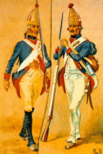
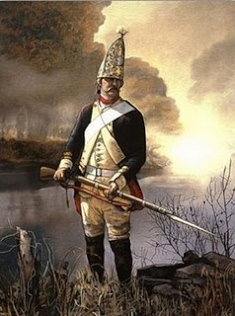


visual references of Hessian uniforms
Hessian soldiers were troops recruited from Germany by England during the revolutionary war, the had a very distinct visual appearance and uniform as shown above. I love the hats they used to wear... shame the character doesn't have a head to wear it on. As I want to remain historically accurate there isn't much I can do to really change his design so much... maybe experimenting more with body shapes and showing his uniform bloodied or decomposing could be a way to make it more interesting.


screenshots from Koalitic's video of the photoshoot
A surprise influence for my design ideas of the horse man was this random halloween photoshoot I saw on instagram by the photographer Jordi Koalitic... The photograph itself isn't really my cup of tea but what caught my eye was the smoking jack-o-lantern I thought it would be so visually interesting to have something like this as the horseman's head... the smoke could really add to the design rather than it just being a pumpkin or a severed neck.

The Original Jack o Lanterns
I was considering how to make the smoking jack-o-lantern head more historically accurate/uncanny so I decided to look into the origins of Jack-o-lanterns. Above is what they used to look like before the modern day adaptation. They were not carved into pumpkins as they are today but instead radishes. I think these old timey versions of the halloween favourite decoration will fit nicely with the horror aesthetic I am going for as well as adding to the authenticity of my design.

These are some design I created for The headless horseman, as I wanted to keep his design quite historically accurate to the revolutionary war hessian uniforms there wasn't much I could experiment with in his design. my favourite of these found is the first and third design... I think I want to combine the bottom part of the first design with the shirt and coat of the third.

I experimented a bit with the way his uniform could be distressed and worn. I wanted to show how he was a solider and that he is undead (outside of him not having a head) I feel that these additions to the design really adds to the atmosphere and makes him look more a lot more threatening.
The Hessian's horse is also an integral part of his design... designing the animal will be just as important as designing the man.


I'm not very confident at drawing horses so I decided to do some studies of them for photographs to help familiarise myself with their anatomy and proportions. For the horse's design I want him to be a mixture between something undead and something hellish. I think having the horse in black will help the horseman really stand out in the pastel setting and establish him as something 'evil' I think maybe having parts of the horse's muscle and bone showing through ripped fur as well as unnaturally coloured eyes would make it look more threatening.
Process : Colour


stills from The Grand Budapest Hotel
For the colouring of this project I decided to do things a little differently, I wanted to design all of the character first and then add colour to them all together so I could ensure a harmonious colour palette between them. As inspiration for my colour palettes I will be drawing a lot of my inspiration from the work of Wes Anderson, his work is so stunning and I hope to achieve a similar aesthetic in my own work.
Katrina

For Katrina a played a lot with colours inspired by The Grand Budapest Hotel. I always imagined Katrina wearing a lot of pinks and peachy tones, I played with adding hits of blues and purples in reference to The Grand Budapest Hotel but my favourite out of these three designs is the third, with different shades of pink and only the tiniest hint of blue on her shoes which mirrors nicely with the blue at the top of her design in her eyes.


I then decided to play with the colour of the pattern on her dress. I really love all of these options for their own individual reasons so it was difficult to decide... I eventually chose the purple flowers (bottom middle) as it is another little reference to The Grand Budapest Hotel as purple is the colour of the Bell Boy's uniform.

Ichabod

I did these initial colour palettes for Ichabod and I really like how they look, however for what I am envisioning I feel they are a little too dark.

I think these colour palettes fit the vision I have for my project much better. I think my favourites are the last two I want to combine different aspects of these for my final design.

Brom

After some consideration and discussing with my friends I decided that The above design would be the one I will continue with in this project, I feel it is the most balanced and the other's silhouette felt a little too top-heavy without a long coat balancing them out. For Brom I wanted to experiment with more flamboyant and vibrant colours. I really like how the purple colour scheme looks out of these along with the almost monochrome styling. I feel that this purple is a little too vibrant though, maybe if I dull down the colours it will fit better?

These are some further experiments, playing more with the purple colour scheme. My favourite is the third design which I think combines hints of pink with the more dull purple very well to create a more regal/affluent atmosphere for this character. However I am a little worried about design readability... maybe the pink wast coat could break up the design better to make it more clear.

The Horseman


For the colours of the horseman I wanted to stay as historically accurate as I could without loosing character. I decided that to help him stand out among the other characters as the antagonist that his palette would be much darker. As inspiration for the different palettes I looked at paintings of hessian soldiers from the revolutionary war. I think my favourite designs are either to completely monochrome grey and black design (2nd from left on top row) or the darker blue and red design (3rd from the left of the top row).
The grey design will insure that he stands out from the rest of the cast who are coloured in vibrant pastel hues. However, the blue and red uniform is so iconic to the revolutionary war and the darker colours will still allow him to stand out. I worry that with the grey design that he could fade too much into the background if I were to paint a scene set in the night time for instance. I also want the blood on his uniform to be really striking and unsettling... the red and blue would not make this possible but the grey design would...

To help with this decision I decided to look back on my original inspirations, specifically Midsommar. One of the images that I was really drawn to when first looking into this movie is the one above. I love how this light and clean palette allows for the blood to be really impactful and strong in the image, making it the focal point. Inspired by this I think I will go forward with the grey design. If it doesn't work out when I try to compose some images then I can always change my mind.


I did a more finalised version of both colour palettes just to be sure the grey is what I wanted and doing this helped me realised I really do prefer it, I think he will look a lot more striking compared to the rest of the characters if he is very dull and almost monochrome.
Process : Textural Experimentation
A line from The Legend of Sleepy Hollow that intrigues me is one in which Irving describes the town itself.

Environment and atmosphere is just as important for concept art as character design, if not more so. I really want to be able to capture this hazey, mystical aura the town has in my work.
To develop the process section of our projects, tutors set us the task of producing 25 post card sized illustrations, I decided to take this as an opportunity to experiment with physical texture to help me create atmospheric, immersive backgrounds.


Inspired by the work of Arthur Rackham I decided to experiment with inks on wet paper to create an almost misty effect. I also looked at different ways to manipulate the ink such as spreading salt and cling film over it while wet. I think I managed to create some really interesting pieces with this technique. The use of purple and yellow was influenced by both my mental vision of the appearance of magic as well as the vibrant colours used in the work of Maxfield Parrish.


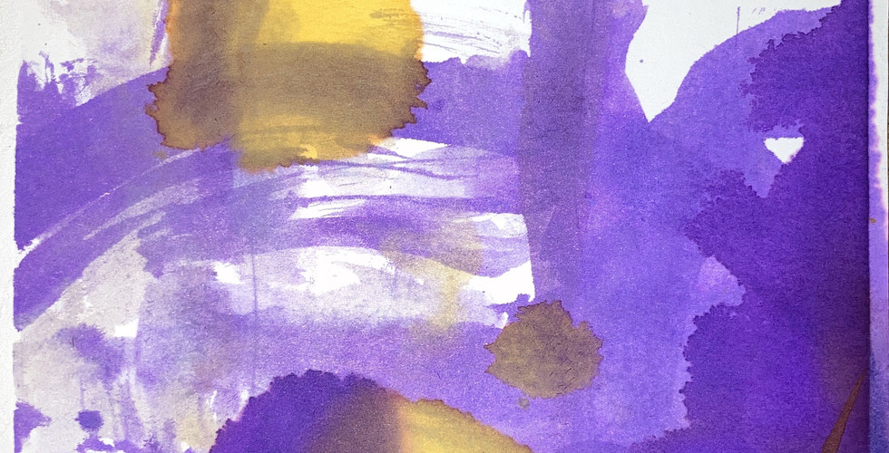


I want to develop these by drawing on top of them digitally to further refine the shapes created by the ink. I think it will look really beautiful.. I will also experiment by playing with the hues/saturation to create different environments and moods as well as making sure I stick to my pastel brief.
Research : Environment Design Inspiration

a postcard from the real Sleepy Hollow depicting the famous 'Horseman Bridge'
Before drawing on top of my previous experiments digitally I wanted to research the actual Sleepy Hollow a little so I knew what I was working with. Although I will be allowing myself some artistic license with the environment and the design of the town of Sleepy Hollow I still wanted some influence from the real thing to be present.


Another reference I wanted to use for these drawings is the Swiss town of Luzern. I travel there every year to visit my family and so it is a place that is very dear to me (these are some pictures I took in February when I visited for carnival/fasnacht as well as some provided to me by my family there). Sleepy Hollow is described as a town of Dutch settlers and so I am sure the architecture had Germanic influence in the time it was set.

some quick studies of buildings in Luzern.
Process : Developing Textural Experimentation

This is my first experiment playing with the textures I created with inks. I wanted to try capture Van Tassel Manor, drawing environments really isn't my strongest skill so I will need to practise and create some more tests. I am relatively happy with how this turned out I really like the purple sky and the magical atmosphere it has from the misty textures. However, I think I want the colours to be more clear and bright like in a Wes Anderson movie... I also think that I should collect some references of background design from different films to help me with the drawing style.


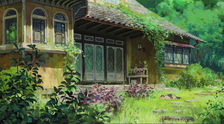


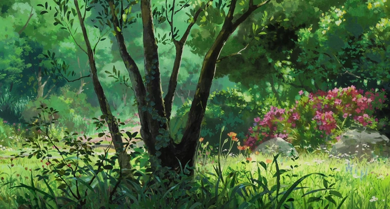


background paintings from Studio Ghibli movies
As a reference for what kind of painting style I should use for future experiments, I looked at backgrounds from Studio Ghibli films. Their movies are so beautiful and in my opinion some of the pinnacles of animation. They have inspired me for a long time and it is my goal to create work with such impact someday. As can be seen from the work selected here Ghibli tends to use an almost line-less style for their backgrounds in a way that is still sharp and detailed but will not retract from the main focus of a scene (the characters). I think this was one of the problems I had with my previous experiment, I used line to create the shapes when I should have been thinking about using light and shadow.
Process : Creating Scenes in DAZstudio
To help visualise the Van Tassel manor in a 3 dimensional way I decided to try and create the basic shape of it in a new programme I have been experimenting with - DAZ studio. It is a rendering software but I was advised that it is also really useful to help with perspectives and backgrounds, which is something I really struggle with.


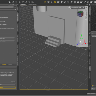


Getting the hang of Daz was quite difficult, understanding how to place and create forms and adjust them to fit my needs was challenging at first but I gained confidence as I continued to play around with the software. These are some screenshots I took of the model I made, I experimented with different angles and perspectives so I can use them as references for possible future drawings.
----------------------------------------------------------------------------------
Communication : Target Audience
Before I develop my project any further I wish to ask myself some questions to make sure I am developing my work is the right direction for what I want to do.
1. What questions are you asking your audience?
As this is a concept art project my aim is to imagine my work in a world of its own and tell a story, create an atmosphere.
2. Who is your audience?
My target Audience for this project I would say is pretty broad. However, as it is a story that will involve a lot of gory imagery I think the youngest members of my target audience will be those in their mid to late teens. This project should peak the interest of those who enjoy watching horror TV shows and Movies, as I am hoping that this project will be able to propose something new and fresh for the genre; As the movie Midsommar did.
3. What do you want people to think about when they look at the work?
It's not so much what I want them to think about when they look at this work... it's more what I want them to feel. I want them to feel this sense of wonder and intrigue but also a sense of discomfort from the uncanny and gruesome imagery.
4. How will people benefit from your work?
I guess people will benefit from the experience of it, being able to explore a famous and culturally important story through a new lens.
5. How would you financially benefit from this work?
I want to create a collection of concept art pages for this project which I will be able to use in my portfolio when I apply for jobs after graduation.
----------------------------------------------------------------------------------
Communication : Final Outcome Research
After asking myself these questions I decided I want to really focus on what I actually want all of this work to come together to create... After discussing with my tutor I decided on the idea of a concept art book/PDF (a digital PDF could be more realistic considering the current COVID-19 restrictions on the use of workshops).
I want my outcome to look as possessional as possible so my next step before anything else should be looking into actual professional concept art books for reference. This will help me on deciding what work I should create next, how the pages of my book should be designed and what content I need to include or leave out. After researching into articles discussing some of the most beautiful concept art books available to purchase/for artists to reference I decided to look further into the concept art book of the Disney movie Tangled.
(Below is the video I watched to see it)
I chose to look into this one above the others as it has a few similarities to my own project: it's colour palette is similar (albeit a bit more vibrant) and it is based off of a well loved, classic story. I thought it would be really interesting to see how the referenced the original story in the book and showed the development from these sources.
I found it so interesting to see this professionally compiled book for a project so similar to mine, it is really inspiring and motivating as I want to create something just as beautiful... I decided to make a checklist of things I want to try include in my final outcome:
details about the original story, why I chose to focus on it and versions of it that have come before my own
my references and influences
initial character designs + the research that went into them
more detailed paintings of these designs
environment research and influences
environment design process
environment paintings
story boarding of scenes that I want to interpret from the book
paintings of these scenes + the processes
I think this list will be edited as the project progresses, but these are my goals for now, making this list will help keep my development focused ! The creation of the detailed paintings of my design is something that I think will be very time consuming... so I should start on these as soon as possible.
size, layout, format, materials, print process, design, planning - MOCK UPS!
Process : Final Outcome initial ideas

To begin to conceptualise my design PDF I decided to sketch up this basic plan of what Katrina's section in the PDF would consist of. I decided to spread out the precesses a bit more than the Tangled book did as I felt that in some of the pages the images were fighting each other and it got a little overwhelming. In these pages I also wanted to include some decorative illustration inspired by the wording in the book. Irving describes Katrina as being 'as plump as a partridge' so I thought it would be nice to reference the original text by having little illustrated partridges adorn some of the pages I also want to include maybe some little painted peaches on the page where I show my experimentation with pattern, in reference to how Irving describes her rosy cheeks.
Artist Research : Shanna Van Maurik


Above is the work of the artist Shanna Van Maurik, her dreamy pastel paintings instantly caught my attention when I saw them on my explore page on instagram.
I love Van Maurik's compositions... how she uses flowers, bugs and colour to tell a story and create an atmosphere. As I want to developing full artworks similar to ones such as these soon, I decided to look into her work for inspiration. They are vibrant but soft... this is something I have been worrying about with a pastel palette, that everything will be too muted and dull and will blur together. Taking inspiration from these paintings will help me avoid that while keeping to my original vision. I thinkI want the more detailed paintings that I mentioned in the above design plans to be in this style.
Communication : Critique Feedback
For the critique on the WIP padlet for our year I decided to present Katrina's final design as it is the one I completed first and one of the ones am most confident with. I was excited to get feedback on this project as a lot of the people in my course are also my target audience.


I got lots of feedback and everyone seemed to really like her design which I am very happy about!
Firstly, I think the comment about researching further into concept art specifically for animated features if a really great idea - I currently only have one reference for this so I think it would be a great idea to expand my research and find things they all have in common to make sure my work can look as professional as possible. I also agree that I think it is time to explore more dynamic poses for my characters, this will be explored in the larger more painterly pieces I will create inspired by the work of Van Maurik. Not only will they help the viewer feel more immersed in my world but it will also help them to further understand the character's individual personalities. As for Zuzanna's comment about including the ink patterns into the designs of the characters I'm not so sure, I think it would look very nice if I wasn't already using them in the backgrounds - it could mean that the character blend too much into the background and the scenes become a little overwhelming for the eyes. However, it could also mean that they fit in with the background better too. I will have to experiment with this to see how it turns out.
Something I was very happy about was Trish's comment about how my work would be really nice as a 'lookbook' of sorts and how she thinks that I should definitely include the process in my final outcome. Something I was worried about when producing the little page plans above was that people wouldn't be interested in seeing that? But I'm so glad it is something that interests others too, it has made me feel a lot more confident about the format of my outcome.
Process : Compositional Drawings

Inspired by the work of Maurik I made a few little compositional drawings of some scenes that interested me from the books as well as shots that can display the landscape design.

I created some more compositions based on smaller details as well, as I don't want to focus on just wide-spread environment shots. I think these are really dynamic and will help convey my vision for my 'animation' as well as the story it's self in an interesting way. I also really enjoy drawing portraits and would say it is one of my strongest skills, so doing a few pieces which focus on the character's faces will be very fun for me!
Process : 'Painted' Compositions
Ichabod About to be Killed

The first of the 'painted' pieces I decided to do is the portrait of Ichabod before he gets beheaded by the hessian. For my first attempt at painting in this style I am really happy with how it turned out, it captured the atmosphere and aesthetic I am aiming for very well and I love how his skin looks especially.
Time-lapsed process of the piece above.
Ichabod's Hat

I found this piece quite challenging as I feel my specialities lie in drawing people's faces rather than objects (this is something I need to improve upon) but nevertheless I am very happy with how this looks. I especially love how the clouds in the sky turned out, they look so fluffy and mystical and have this sense of depth to them. I also really enjoyed drawing the mushrooms adorning the floor. However, I am not 100% happy with how the hat looks. I feel the shape is a little off? I decided to keep it as it looks for now as it is still decent and I need to make sure the other compositions get completed on time. If I have time though I will go back and edit it.
Time-lapsed process of the piece above.
Brom "Bones" van Brunt

This is my favourite of the three paintings I have done so far, I love how the colours look. It creates a very magical atmosphere and they compliment each other really well! My favourite part of the piece is the leaves - specifically the one in the bottom left had corner.
In addition to this I am also really proud of how his expression turned out. I think I captured the smug, knowing look really well. I battled with the facial expression quite a bit during the process of creating this piece so I am happy I managed to create something I like.
Time-lapsed process of the piece above.
Van Tassel manor

Although this is a big improvement from the first environment illustration I attempted I am still not 100% happy with how this looks... this was the most challenging on the compositions I have made so far as painting buildings in a style that fits with my own it one of my weakest skills. However there are still some aspects of the piece that I am proud of and I wish to discuss those first.
I really love how I was able to capture a proper sense of depth in the composition thanks to the leaves that frame the corners. I am also happy with the perspective of the house, I effectively managed to use the 3D model I created in DAZ to help me accomplish this and it is a real game changer.
The parts of the piece that I am not satisfied with are as follows... The path near the house doesn't look great, I think I lost my motivation while trying to draw this which makes it look a little rougher than the rest of the composition. The other part of the piece I am not pleased with is the texture of the building. I tried so hard to not make it look flat and although it is better than before and I kind of like how the roof looks I think I need to practise this a lot more.
Overall though I am very glad I created this piece, it is an important part of visualising my project and has shown a big improvement from my first attempt.
(unfortunately I lost the file of the time lapse for this piece before I could upload it to youtube, which is a shame because it is the painting I spent the longest on.)
The Chase

Time-lapsed process of the piece above.
Process : Life Drawing


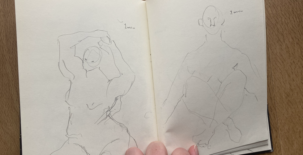
An essential part of being a concept artist is drawing skills. It is simple, to be a concept artist you must be an exceptional drawer so that you are able to convey your ideas clearly to other members of the team. I want to keep my drawing skills sharp so participated in some online sessions held by hw Life drawing. I love life drawing because I always feel connected to an artistic tradition of sorts whenever I'm drawing a model.
Process : More Life Drawing


to try overcome art block and anxiety revolving around my university work I decided to go for a walk around the area I am living in. I decided to bring my sketchbook and a pen with me and draw a scene or something that interested me every time I passed a bench I could sit on. I some pigeons and ducks but also some different views... It's good that this experience allowed me to practise drawing interesting scenery even if they aren't very good and just sketchy. It helped me to practise the idea of depth and different planes in the composition. I think now to keep up my motivation for this project and make sure I complete everything on time I need to start thoroughly planning my final outcome from this point forward. So I know exactly what I need to produce in the timeframe I have remaining.
Realisation : Page Design Planning

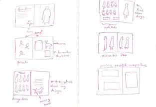


I decided to plan out some page ideas for the other characters I designed, I tried to give some variation in the order and layout of each section so it wouldn't get too repetitive and boring. I also want to incorporate some full page spreads of the painterly compositions I created to help break it up a little. I also think that a section dedicated to what inspired the environment and the buildings would be interesting too.

I planned a few more pages to show the process of the town design. It's important to include the town's design process as the purpose of concept art as previously discussed is convey and idea or atmosphere so the environment is just as important as the characters that reside in it.
My main concerns are the page compositions looking too 'collage' like or blocky. I also thought that as this is an online PDF I should look at each spread as one image rather than a double page spread. I guess designing books in this way is so ingrained in my mind i didn't even think twice about it.
Realisation : First Mock-up Design Plan


This is my plan for the PDF outcome, when designing each page I wanted to make sure that it had elements of an art book almost rather than just collaged work. To do this I included complimentary illustrations that will be specially made for the pages they are on, full page spreads of my 'painted' pieces and a couple of pages of little sketches of animals that I have done which reference the original text. I hope that these break up the slightly repetitive format a little in a way that makes it both pleasing to the eye and interesting for the reader.
Something I need to think about when I start putting together these pages is firstly what colour/colours should the pages themselves be and what font/fonts I should use. I am actually considering using my own handwriting for the text in the PDF as I feel it will make it look less cold and slide-show like, as for colour of each page I think I will start with everything on a white base and then work from there. As this is a project that aims to help develop our portfolios or be something to show to potential clients I think a white background would look the most professional.
Realisation : Type Experimentation


To make sure using my own handwriting is what I want to do for this PDF I decided to experiment with different style of hand writing as well as a font. I think my two favourites are the rounder upright writing and the italic, sharper writing. I might go forward with the rounder writing and see how it looks, as it is easier to read which is very important.
Communication : Critique Feedback
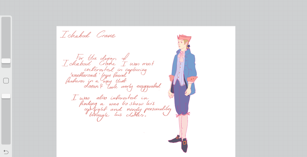
For our final project critique I presented this initial mock up of Ichabod's section of my PDF. I wanted to mainly get feed back on the composition of the pages and how they could be improved. The presentation on my work in the final PDF outcome will be so so important, I need to make sure the work i am presenting is aesthetically pleasing and professional looking.


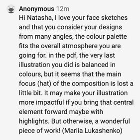


This is the collection of feedback I got back from the critique, all of the comments are very positive overall so I am very happy ! Something that came up often was how much everyone loved the colour palette and the 'painted' compositions, a comment from Lucie even mentioned how they give a 'magical' atmosphere which is exactly what I wanted. On the same topic of colour palette Trish discusses the role blood will play in my work, she says it would be interesting to keep the blood a vibrant pink to heighten the uncanny feeling in the work. Although this is an interesting idea and one that I have seen work well before (see the game series Danganronpa) I think I want to keep the blood a dark crimson to contrast with the light, pastel colours that will be everywhere else in the compositions. I think even though it is the usual colour of blood, this contrast will help keep the uncanny, uncomfortable feeling.


some stills from Danganronpa
She also mentions how the use of flowers as symbolism for death could be interesting... I actually really love this idea but I am not sure how I could incorporate it at this point in the project, maybe if I was doing an actual animation. I think this idea is something I will keep in mind for the development of future projects.
As for feedback on how the layout of my PDF one suggestion I received was to slightly tint the white background of the pages so that it is less stark... I originally wanted to keep the white background so that they looked more 'professional' but I think that this could be the thing I was missing from the compositions.
Realisation : Responding to Critique feedback

the edits suggested by Daniel
In response to a comment made during the critique my Mariia I decided to go back and try work into the Hat composition. However, I was really struggling with the lighting and making it pop more. I decided to ask one of my friend's for some advice in how it could be improved. I sent him the image and he walked me through some suggestions on a screen share and this was really helpful. I think the composition now looks a lot more punchy and effective. I think I could want to tone down the values a little bit just so that it could fit in with the other paintings, though.

I think this edited composition looks so much better than before, it feels more balanced and the colour saturation matches the other compositions more. I also really the addition of the blood and the moon, as well as the storytelling aspect of the horseman bridge in the background.
Time-lapsed process of the editing.
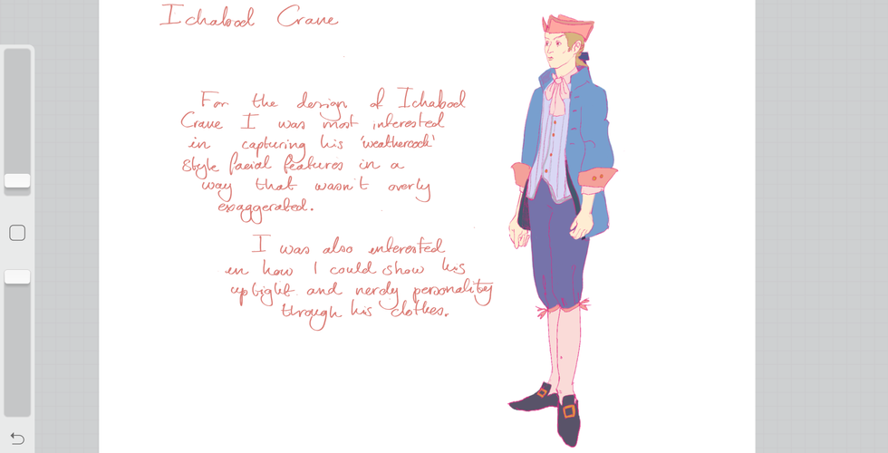
Realisation : Responding to Critique feedback


In response to the suggestion I received to change the background colour of the pages in my PDF I decided to experiment with a few different variants. I think my favourite out of these is the light pink as it matches the aesthetic I have been developing for this project. I also like how compliments the pink text and the colours in his design.
Realisation : Outcome
It is almost hard to evaluate everything I have made for this project as there have been so many high and low points for me. So, I shall focus on the two biggest parts of project instead, firstly the character design. I am very happy with how these turned out, in my opinion, the designs are not only historically and narratively accurate but also fit my initial vision of a pastel themed horror as well. I believe this is down to the amount of research that went into them alongside my trial and error design process. This allowed me to explore all my options and make sure I wasn’t missing out on something because I didn’t explore it. I also think my stubborn nature helped too, I was determined to not only stay accurate to the descriptions in the book but also accurate to what the characters actually would have worn inn the time it was set. This already helped me narrow down my options and stay focused. The designs are also aesthetically pleasing and fit really well together as a set. Having the designs look incongruous next to each other was one of my biggest concerns at the start of this project so I am glad that I managed to achieve this.
As for the PDF itself I really love how it looks. The combination of my handwriting and loose sketches with carefully planned layout creates something that combines the best aspects of a sketchbook and a portfolio, it is so wonderful and unique. I also feel that when an employer looks at this PDF I have created they will not only be able to get a sense of what my work is like, but also what I am like as a person. I have put so much thought into this project and it is so true to my own style and interests that I think it is a wonderful reflection of myself as a creative.
To conclude, I am very happy with the outcome I was able to create for this project. I feel I have achieved what I set out to do by creating an easily sendable file that showcases my skills to potential employers. I am proud of all the work and research that has gone into this project and I have learned so much from this process. Not only about myself but also about the industry I so wish to be a part of


Comments